Input (Form) Elements in HTML

Input (Form) Elements in HTML
1. The <form> Element
An HTML form is used to collect user input. The user input is most often sent to a server for processing.
The HTML
<form>element is used to create an HTML form for user input:<form> . form elements . </form>The
<form>element is a container for different types of input elements, such as:<input><label><select><textarea><button><fieldset><legend><datalist><output><option><optgroup>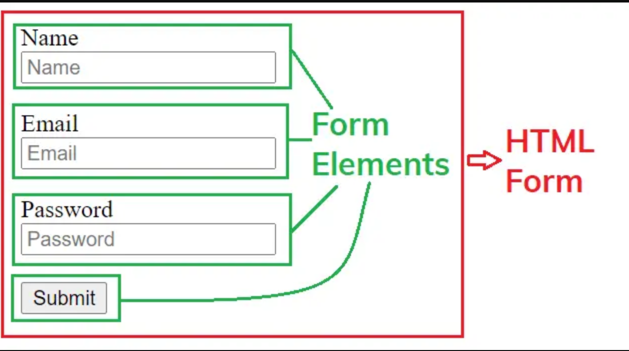
2.The <input> Element
The
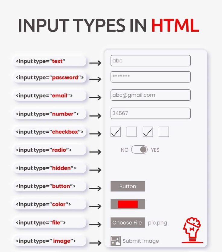
<input>HTML element is used to create interactive controls for web-based forms to accept data from the user; a wide variety of types of input data and control widgets are available, depending on the device and user agent.The
<input>tag specifies an input field where the user can enter data.The HTML
<input>element is the most used form element.An
<input>element can be displayed in many ways, depending on thetypeattribute.How an
<input>works vary considerably depending on the value of itstypeattribute, hence the different types are covered in their separate reference pages. If this attribute is not specified, the default type adopted istext.Here are the different input types you can use in HTML:
<input type="button"><input type="checkbox"><input type="color"><input type="date"><input type="datetime-local"><input type="email"><input type="file"><input type="hidden"><input type="image"><input type="month"><input type="number"><input type="password"><input type="radio"><input type="range"><input type="reset"><input type="search"><input type="submit"><input type="tel"><input type="text"><input type="time"><input type="url"><input type="week">
The default value of the
typeattribute is "text".
1.Input Type - Text
<input type="text">- Displays a single-line text input field.Line-breaks are automatically removed from the input value.
Example:
A form with input fields for text:
-
The <label> Element
The
<label>element defines a label for several form elements.The
<label>element is useful for screen-reader users, because the screen-reader will read out loud the label when the user focuses on the input element.The
<label>element also help users who have difficulty clicking on very small regions (such as radio buttons or checkboxes) - because when the user clicks the text within the<label>element, it toggles the radio button/checkbox.The
forattribute of the<label>tag should be equal to theidattribute of the<input>element to bind them together.
2.Input Type - Password
<input type="password">defines a password field.A single-line text field whose value is obscured. Will alert user if site is not secure.
Example:
A form with input fields for password:
-
3.Input Type - Email
The
<input type="email">is used for input fields that should contain an e-mail address.Depending on browser support, the e-mail address can be automatically validated when submitted.
Some smartphones recognize the email type, and add ".com" to the keyboard to match email input.
A field for editing an email address. Looks like a
textinput, but has validation parameters and relevant keyboard in supporting browsers and devices with dynamic keyboards.Example:
A form with input fields for Email:
4.Input Type - Button
A push button with no default behaviour displays the value of the value attribute, empty by default.
Example:
A form with input fields for the button:
-
5.Input Type - Radio-Button
<input type="radio">defines a radio button.Radio buttons let a user select ONLY ONE of a limited number of choices.
A radio button, allows a single value to be selected out of multiple choices with the same
namevalue.-
6.Input Type - Check Box
<input type="checkbox">defines a checkbox.Checkboxes let a user select ZERO or MORE options of a limited number of choices.
A check box allowing single values to be selected/deselected.
Example:
A form with input fields for Checkbox:
-
7.Input Type - Submit Button
<input type="submit">defines a button for submitting form data to a form handler.The form handler is typically a server page with a script for processing input data.
The form handler is specified in the form's
actionattribute.A button that submits the form.
Example:
A form with input fields for submission:
-
If you click "Submit", the form data will be sent to a page called "/action_page.php".
8.Input Type - Reset Button
A button that resets the contents of the form to default values. Not recommended.
<input type="reset">defines a reset button that will reset all form values to their default values:Example:
A form with input fields for reset button:
-
If you change the input values and then click the "Reset" button, the form data will be reset to the default values.
9.Input Type - Color
The
<input type="color">is used for input fields that should contain a color.Depending on browser support, a color picker can show up in the input field.
A control for specifying a color; opening a color picker when active in supporting browsers.
Example:
A form with input fields for Color:
-
Note: type="color" is not supported in Internet Explorer 11 or Safari 9.1 (or earlier).
10.Input Type - Date
A control for entering a date (year, month, and day, with no time). Opens a date picker or numeric wheels for year, month, and day when active in supporting browsers.
The
<input type="date">is used for input fields that should contain a date.Depending on browser support, a date picker can show up in the input field.
type="date" is not supported in Internet Explorer 11 or prior Safari 14.1.
Example:
A form with input fields for date:
-
If you click "Submit", the form data will be sent to a page called "/action_page.php".
11.Input Type - File
A control that lets the user select a file. Use the
acceptattribute to define the types of files that the control can select.The
<input type="file">defines a file-select field and a "Browse" button for file uploads.Example:
A form with input fields for file:
-
Show a file-select field which allows a file to be chosen for upload and Select a file.
12.Input Type - Image
A graphical
submitbutton. Displays an image defined by thesrcattribute. Thealtattribute displays if the imagesrcis missing.The
<input type="image">defines an image as a submit button.The path to the image is specified in the
srcattribute.Example:
A form with input fields for image:
-
The input type="image" sends the X and Y coordinates of the click that activated the image button.
13.Input Type - Hidden
A control that is not displayed but whose value is submitted to the server. There is an example in the next column, but it's hidden!
The
<input type="hidden">defines a hidden input field (not visible to a user).A hidden field lets web developers include data that cannot be seen or modified by users when a form is submitted.
A hidden field often stores what database record that needs to be updated when the form is submitted.
Note: While the value is not displayed to the user in the page's content, it is visible (and can be edited) using any browser's developer tools or "View Source" functionality. Do not use hidden inputs as a form of security!
14.Input Type - Range
The
<input type="range">defines a control for entering a number whose exact value is not important (like a slider control).The default range is 0 to 100.
However, you can set restrictions on what numbers are accepted with the
min,max, andstepattributes:Depending on browser support: The input type "range" can be displayed as a slider control.
-
15.Input Type -Time
The
<input type="time">allows the user to select a time (no time zone).Depending on browser support, a time picker can show up in the input field.


