The CSS Box Model

The Box Models in CSS
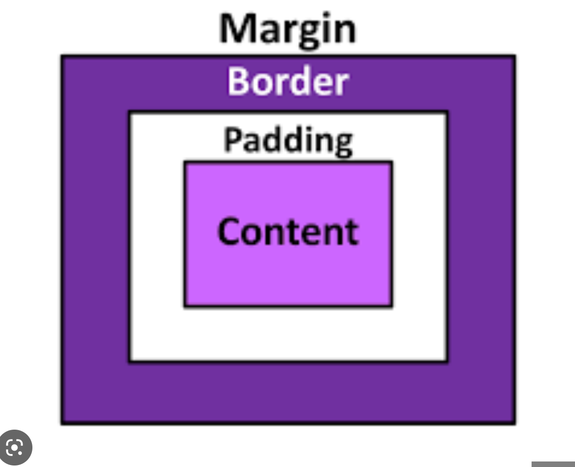
Box Model
All HTML elements can be considered as boxes. In CSS, the term "box model" is used to create the design and layout of websites.
The CSS Box model is essentially a box that wraps around every HTML element and it consists of the following:
The actual content Area
The Padding Area
The Border Area
The Margin Area
The image below gives an illustration of what the Box model is

The CSS box model allows us to add a border around elements, and to define space between elements.
The image below illustrates the box model hierarchy:
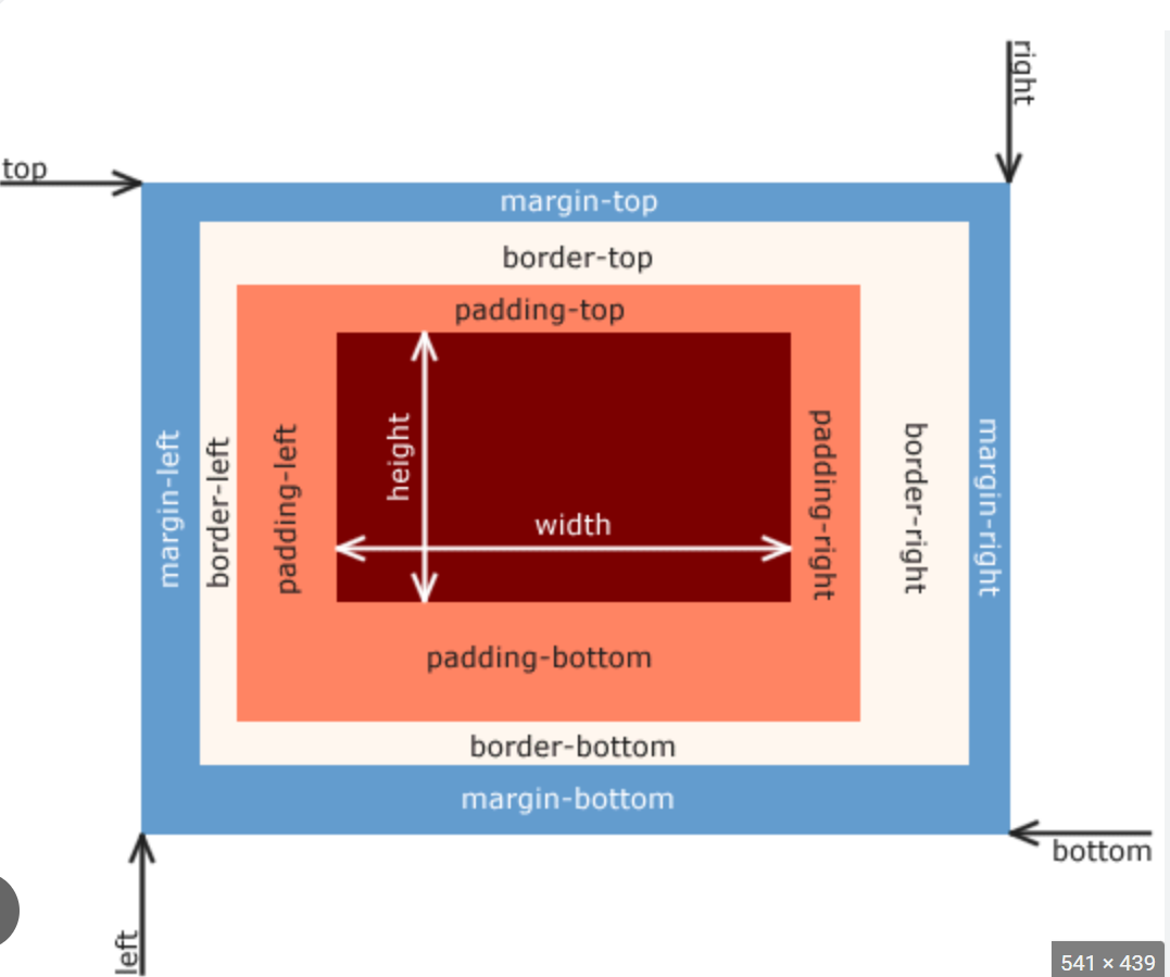
- The total width of a box is therefore
left-margin+left-border+left-padding+width+right-padding+right-border+right-margin. Similarly, the total height of a box equalstop-margin+top-border+top-padding+height+bottom-padding+bottom-border+bottom-margin.
1.The Content Area
The content of the box, where text and images appear.
Material such as text, photographs, or other digital media is included in this area.
It is constrained by the information edge, and its proportions are dictated by the width and height of the content enclosure.
Example:
-
The inner content of your HTML element. In a
<p>element, for example, is the area where text would be displayed.Using the example above, the content is the entire area which is made visible with the pink background color.
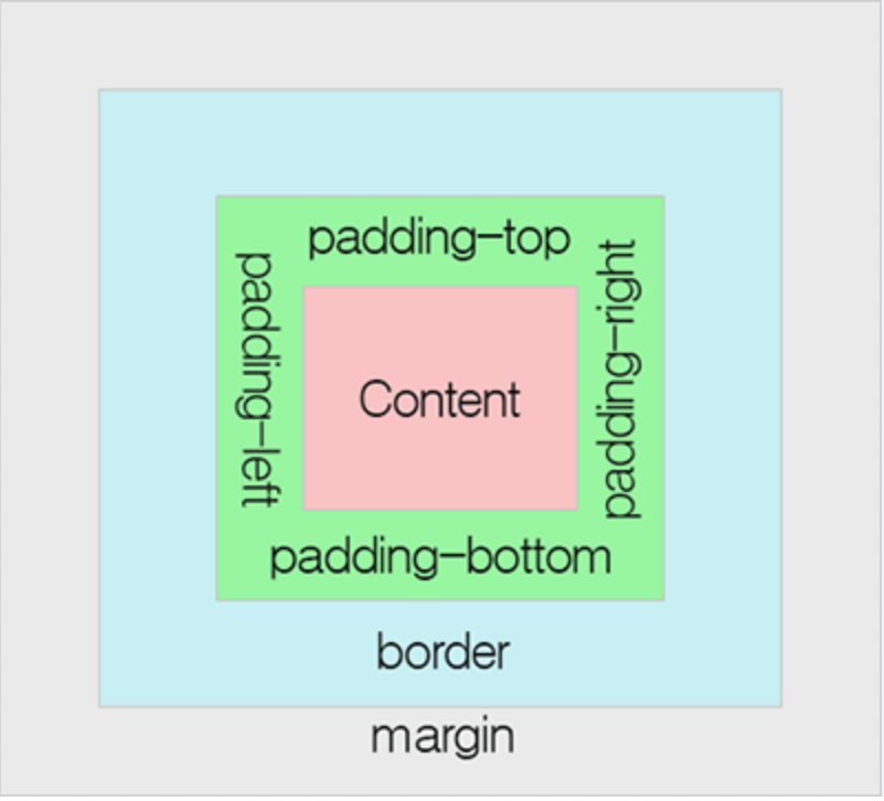
2.The Padding Area
Padding is the space between the border and the content of an element. it is the transparent area around the content that also shares the background color.
The CSS padding properties are used to generate space around an element's content, inside of any defined borders.
With CSS, you have full control over the padding. There are properties for setting the padding for each side of an element (top, right, bottom, and left).

#Padding - Individual Sides
CSS has properties for specifying the padding for each side of an element:
padding-top - It is used to set the top padding of an element.
padding-right - It is used to set the right padding of an element.
padding-bottom - It is used to set the bottom padding of an element.
padding-left - It is used to set the left padding of an element.
#CSS Padding Values
All the padding properties can have the following values:
Length - specifies padding values in px, pt, cm, etc.
Percentage(%) - specifies padding values in % of the width of the containing element.
Inherit - specifies that the padding values should be inherited from the parent element
Negative values are not allowed in the padding area.
Syntax:
                            div {
                              padding-top: 50px;
                              padding-right: 30px;
                              padding-bottom: 50px;
                              padding-left: 80px;
                            }
Example:
Set different padding values for all four sides of paragraph elements.
-
This first paragraph element has no specified padding.
The second paragraph element with a class name "padding" has a top padding of 50px, a right padding of 30px, a bottom padding of 50px, and a left padding of 80px.
#Padding - Shorthand Property
To shorten the code, it is possible to specify all the padding properties in one property.
The padding property is a shorthand property for the following individual padding properties:
padding-top
padding-right
padding-bottom
padding-left
So, here is how it works:
There are four ways of specifying the shorthand padding property that are as follows:
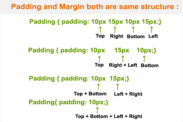
1.The padding shorthand property with four values:
padding: 10px 20px 15px 12px;
top padding is 10px
right padding is 20px
bottom padding is 15px
left padding is 12px
Syntax:
                          p{
                          padding: 10px 20px 15px 12px;
                          }
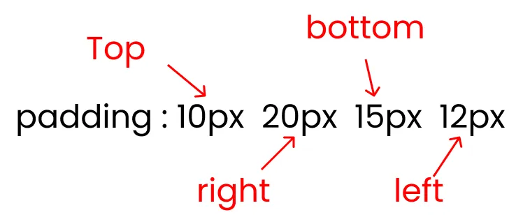
Example:
The Padding property has four values:
-
The above example shows a paragraph element that has a top padding of 10px, a right padding of 20px, a bottom padding of 15px, and a left padding of 12px.
2.The padding shorthand property with three values:
padding: 20px 30px 50px;
top padding is 20px
right and left paddings are 30px
bottom padding is 50px
Syntax:
                          p{
                          padding: 20px 30px 50px;
                          }
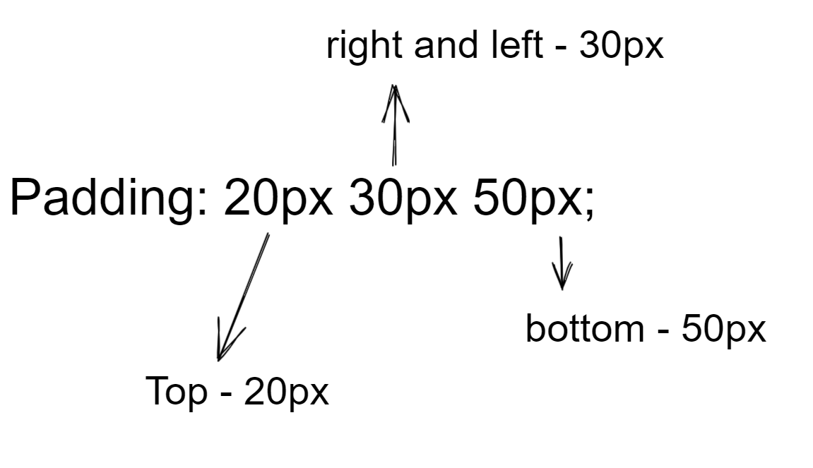
Example:
The Padding property has three values:
-
The above example shows a paragraph element that has a top padding value is 20px, a left and right padding value is 30px, and a bottom padding value is 50px.
3.The Padding shorthand property with two values:
padding: 20px 30px;
top and bottom padding values are 20px.
right and left paddings are 30px.
Syntax:
                          p{
                          padding: 20px 30px;
                          }
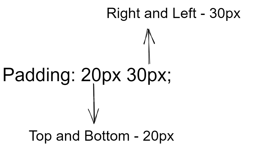
Example:
The Padding property has Two values:
-
The above example shows a paragraph element that has a top and bottom padding value is 20px and a left and right padding value is 30px.
4.The Padding shorthand property with one value:
padding: 20px;
- All four padding values are 20px.
Syntax:
                          p{
                          padding: 20px;
                          }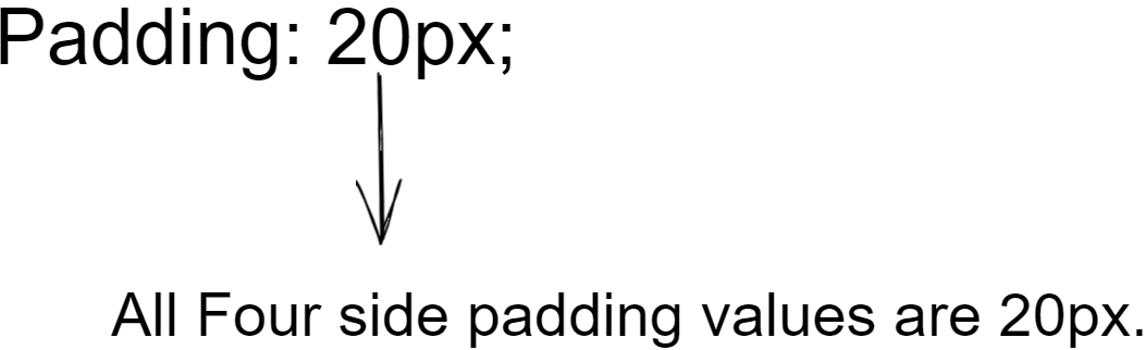
Example:
The Padding property has one value.
-
It sets the equal value of the top, right, bottom, and left padding of 20px.
Outlook of all four ways of specifying the shorthand padding property that is as follows below:
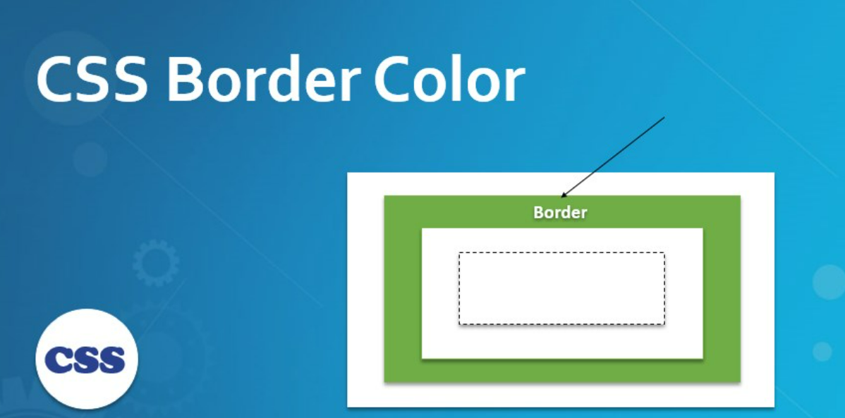
3.The Border Area
The border is an area around the padding that extends from the outer edge of the padding box to the inner edge of the margin.
The border property lets us add and style a line around the content padding area.

The Border Declaration
The CSS border properties are used to specify the style, color and size of the border of an element. The CSS border properties are given below:
CSS Border-Style
CSS Border-Color
CSS Border-Width
CSS Border-Radius
1. The CSS Border Style
The Border style property is used to specify the border type which you want to display on the web page.
Some border-style values are used with border-style property to define a border.
The border-style property lets you choose the style of the border.
The following values are allowed:
Dotted - It is used to define a dotted border.
Dashed - It is used to define a dashed border.
Solid - It is used to define a solid border.
Double - It defines two borders with the same border-width value.
Groove - It defines a 3d grooved border. The effect is generated according to border-color value.
Ridge - It defines a 3d ridged border. The effect is generated according to the border color value.
Inset - It defines a 3d inset border. The effect is generated according to border-color value.
Outset - It defines a 3d outset border. The effect is generated according to border-color value.
None - It doesn't define any border.
Hidden - It is used to define a hidden border
Syntax:
                    container{
                    border-style: dotted | dashed | solid | double | groove | ridge | inset | | none | hidden | outset
                    }
The below image illustrates the above border styling:

The default for the style is
none, so to make the border appear at all you need to change it to something else.solidis a good choice most of the time.Example:
The Below example program shows the different border styles:
-
#CSS Border Specific Styling Sides
- The border-style property can have from one to four values (for the top border, right border, bottom border, and left border).
We can set a different style for each edge using the below properties are:
border-top-style
border-right-style
border-bottom-style
border-left-style
Syntax:
                    p{
                    border-top-style: dashed;
                    border-right-style: solid;
                    border-bottom-style: double;
                    border-left-style: dotted;
                    }
Example:
The Below example program shows the different border styles for each edge:
-
2. we can also use
border-stylewith multiple values to define them, using the usual Top-Right-Bottom-Left order: Syntax:
                    p{
                      border-style: solid dotted solid dotted;
                    }
Example:
The Below example program shows the different border styles for each edge in single line code:
-
2.The CSS Border Color
The space around the padding and margin is called The Color between the padding and margin is called as Border color.
Border color is used when we want to separate the HTML body from one content to another content. Border color is applied on all sides at a time or different sides at a time by using border-color.
The Border color property is not used alone. It is always used with other border properties like "border-style" property to set the border first otherwise it will not work.
The Border Color can be set by the following values
1. Color of the name
2. Hex Values
3. HSL Values
4. RGB Values.
Name -
In CSS, a color can be specified by using a predefined color name.
CSS/HTML support 140 standard color names.
Some of the name of the colors are Tomato, Orange, DodgerBlue, MediumSeaGreen, Gray, SlateBlue, Violet, LightGray etc.
HEX Value -
A hexadecimal color is specified with #RRGGBB, where the RR (red), GG (green) and BB (blue) hexadecimal integers specify the components of the color.
Where RR (red), gg (green) and bb (blue) are hexadecimal values between 00 and ff (same as decimal 0-255).
For example, #ff0000 is displayed as red, because red is set to its highest value (ff) and the others are set to the lowest value (00).
To display black, set all values to 00, like this: #000000.
To display white, set all values to ff, like this: #ffffff.
Some of the hexadecimal color values are #ff0000, #0000ff, #3cb371, #ee82ee, #ffa500 etc.
RGB Value-
An RGB color value represents RED, GREEN, and BLUE light sources.
In CSS, a color can be specified as an RGB value, using this formula:
rgb(red, green, blue).
Each parameter (red, green, and blue) defines the intensity of the color between 0 and 255.
For example, rgb(255, 0, 0) is displayed as red, because red is set to its highest value (255) and the others are set to 0.
To display black, set all color parameters to 0, like this: rgb(0, 0, 0).
To display white, set all color parameters to 255, like this: rgb(255, 255, 255).
some of the rgb values are rgb(255, 0, 0), rgb(0, 0, 255), rgb(60, 179, 13), rgb(238, 130, 238), rgb(255, 165, 0), rgb(106, 90, 205).
HSL Value:
HSL stands for hue, saturation, and lightness.
In CSS, a color can be specified using hue, saturation, and lightness (HSL) in the form:
hsl(hue, saturation, lightness).
Hue is a degree on the color wheel from 0 to 360. 0 is red, 120 is green, and 240 is blue.
Saturation is a percentage value. 0% means a shade of gray, and 100% is the full color.
Lightness is also a percentage. 0% is black, 50% is neither light or dark, 100% is white.
Some of the HSL Values are hsl(0, 100%, 50%), hsl(240, 100%, 50%), hsl(147, 50%, 47%), hsl(300, 76%, 72%), hsl(39, 100%, 50%), hsl(248, 53%, 58%).
If you don’t set a color, the border by default is colored using the color of the text in the element.
Syntax:
                  p{
                  border-style: solid;
                  border-color: red; |
                                #6a5acd; /*(HEX Value)*/  |
                                rgb(0, 0, 255); /*RGB Value*/ |
                                hsl(300, 76%, 72%); /*HSL Value*/
                  }
Example:
-
#CSS Border Specific Color Sides
- We can also set the color of each edge (Top-Right-Bottom-Left) separately by using 4 values:
Syntax - 1:
                  p{
                  border-style: dotted;
                  border-color: value1, value2, value3, value4; //border color values
                  }
Example:
The Below example program shows the different border colors for each edge in single line code:
-
Explanation: If we apply border-color with 4 values then the first value is for the top, the second value is for the right, the third value is for the bottom and the fourth value is for the left applied respectively.
Syntax - 2:
                  div{
                  border-color: value1, value2, value3; //border color values
                  }
Explanation: If we apply border-color with 3 values then the first value is for the top, the second value is for the left and right, and the third value is for the bottom applied respectively.
Syntax - 3:
                  div{
                  border-color: value1, value2; //border color values
                  }
Explanation: If we apply border-color with 2 values, then the first value is for the top and bottom and the second value is for the left and right applied respectively.
Syntax - 4:
                  div{
                  border-color: value//border color value
                  }
Explanation: If we apply border-color with only a single value, then applied it for all four sides equally.
2. We can also use the specific edge properties as
border-top-color
border-right-color
border-bottom-color
border-left-color
If we want to apply border color only one side like top or right or bottom or left. You can use the below syntaxes.
Syntax - 1:
                  div{
                  border-top-color: value//border top side color
                  }
Syntax - 2:
                  div{
                  border-right-color: value//border right side color
                  }
Syntax - 3:
                div{
                  border-bottom-color: value//border bottom side color
                  }
Syntax: 4:
                div{
                  border-left-color: value//border left side color
                  }
3.The CSS Border Width
The border-width property is used to set the border's width.
The width can be set as a specific size (in pixels (px), pt, cm, em, rem) or any other valid length value.
We can also use one of the three pre-defined values to set the width of the border.
Thin
Medium
Thick
The border-width property is not used alone. It is always used with other border properties like "border-style" property to set the border first otherwise it will not work.
Syntax:
                p{
                border-width: thin | medium | thick | numbered values in px, pt, cm, em;
                }
Example:
The below example program shows the different border widths:
-
#CSS Border Specific Width Sides
The
border-widthproperty can have from one to four values (for the top border, right border, bottom border, and left border).- Use the specific edge properties are
border-top-width
border-right-width
border-bottom-width
border-left-width.
If we want to apply border width on only one side like top or right or bottom or left. You can use the below syntaxes.
Syntax - 1:
                div{
                border-style: solid;
                border-top-width: value//border top side width
                  }
Syntax - 2:
                div{
                border-style: solid;
                border-right-width: value//border right side width
                 }
Syntax - 3:
                div{
                border-style: solid;
                border-bottom-width: value//border bottom side width
                  }
Syntax - 4:
                div{
                border-style: solid;
                border-left-width: value//border left side width
                  }
We can also set the width of each edge (Top-Right-Bottom-Left) separately by using 4 values.
Syntax - 1:
                  p{
                  border-style: dotted;
                  border-width: value1, value2, value3, value4; //border width values
                  }
Example:
The Below example program shows the different border colors for each edge in single line code:
-
Explanation: If we apply border-width with 4 values then the first value is for the top, the second value is for the right, the third value is for the bottom and the fourth value is for the left applied respectively.

Syntax - 2:
                  div{
                  border-width: value1, value2, value3; //border width values
                  }
Explanation: If we apply border-width with 3 values then the first value is for the top, the second value is for the left and right, and the third value is for the bottom applied respectively.
Syntax - 3:
                  div{
                  border-width: value1, value2; //border width values
                  }
Explanation: If we apply border-width with 2 values, then the first value is for the top and bottom and the second value is for the left and right applied respectively.
Syntax - 4:
                  div{
                  border-width: value//border width value
                  }
Explanation: If we apply border width with only a single value, then applied it for all four sides equally.
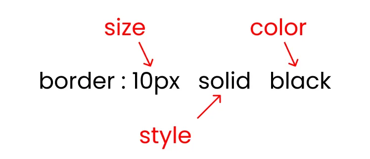
#CSS Shorthand Border Property
The border property is a shorthand property for the following individual border properties:
border-widthborder-style(required)border-color
The below image shows the border shorthand property:
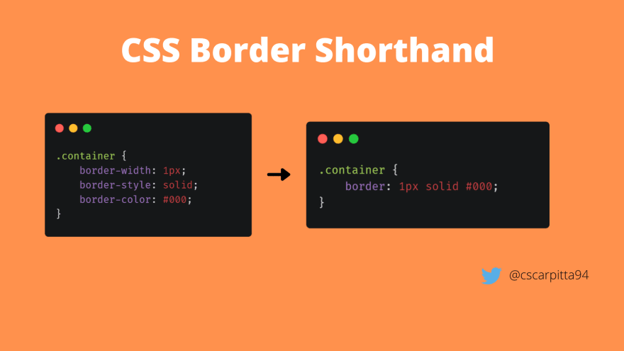
Syntax:
                p{
                border:10px solid black;
                }
Example:
-
Explanation:
The above example defines a border with solid border styling and a width of 2 pixels and color of the border is green color.
We can also use the edge-specific properties are
border-top
border-right
border-bottom
border-left.
Syntax:
                p{
                  border-top: 2px black solid;
                  border-right: 5px red dashed;
                  border-bottom: 1px green dotted;
                  border-left: 3px blue double;
                }
Example:
-
4. The CSS Rounded Borders
Border Radius is used to set rounded corners to the border. You need to pass a value that will be used as the radius of the circle that will be used to round the border.
The Border Radius property is used to add rounded borders to an element.
Syntax:
              div{
              border-radius: 10px;
              }
The above image shows some of the rounded corner borders.
Example -1
We could round the corners slightly with
border-radius: 10px;-
Example - 2:
When working with square elements, you can use
border-radius: 50%;to create a circle:-
Example - 3:
Use a larger radius such as
border-radius: 100px;to create a pill shape:-
#CSS Border-Radius - Specify Each Corner
The
border-radiusproperty can have from one to four values.Here are the rules:
Four values - border-radius: 15px 50px 30px 5px;
Syntax:
              div{
              border-radius: value1, value2, value3, value4; /*Border radius values*/
Example:
-
Explanation - First value applies to the top-left corner, the second value applies to the top-right corner, the third value applies to the bottom-right corner, and the fourth value applies to the bottom-left corner.
-
Three values - border-radius: 15px 50px 30px;
Syntax:
div{ border-radius: value1, value2, value3; /*Border radius values*/-
Explanation:
- First value applies to the top-left corner, the second value applies to the top-right and bottom-left corners, and the third value applies to the bottom-right corner.
Two values - border-radius: 15px 50px;
Syntax:
              div{
              border-radius: value1, value2; /*Border radius values*/
Example:
-
Explanation:
- First value applies to the top-left and bottom-right corners, and the second value applies to the top-right and bottom-left corners.
One value - border-radius: 15px;
Syntax:
              div{
              border-radius: value /*Border radius values*/
Example:
-
Explanation:
- The value applies to all four corners, which are rounded equally.
We can also use the edge-specific properties are
border-top-left-radius
border-top-right-radius
border-bottom-left-radius
border-bottom-right-radius.
Syntax:
              div{
                  border-top-left-radius | border-top-right-radius |   border-bottom-right-radius |  border-bottom-left-radius: 10px;
              }
Example:
-
4.The Margin Area
The CSS Margin Properties are used to create space around elements, outside of any defined borders.
With CSS, you have full control over the margins. There are properties for setting the margin for each side of an element (top, right, bottom, and left).
To make a nice-looking webpage, it's important to add space between HTML elements. One way to do this is to add margins, which will create space around one or more sides of the element.

Negative values are allowed in the Margin area.
Syntax:
A simple margin declaration might look like this:
  p{
  margin: 10px;
  }
That declaration means that the margin box should extend
10pxin all four directions—left, right, up, and down—beyond the size of the border box.Example- 1:
-
Example - 2:
Consider a
<p>element with some text, some color declarations, apaddingdeclaration, and aborderdeclaration.Loaded on a webpage, it might look like this:

Because the margin creates an invisible box around an HTML element, it might not be apparent just by looking at it that there's anything there.
However, if you were to add a second
<p>element, it becomes much clearer: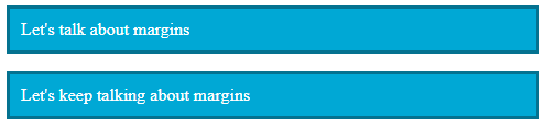
The white space all around your paragraphs is the margin, but the space between your two paragraphs shows you exactly how far it extends.
By default, browsers apply a margin of around
16pxto every<p>element, but you can override that with your own CSS.Example - 3:
If you added a
margin: 50px;declaration, your two paragraphs would look more like this: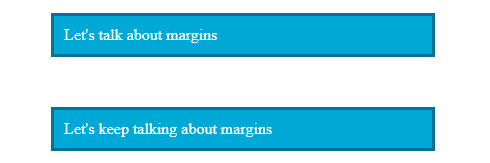
Notice that there is more white space on the left and right as well.
You can also change the margin to reduce white space, or even eliminate it.
Example - 4:
A
margin: 0;declaration would look more like this: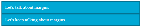
When adding a margin value of
0, you can omit thepx.You could even add a negative margin, like
margin: -15px;, to make them overlap: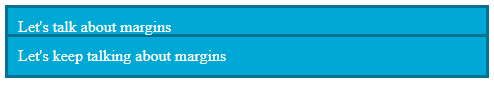
#Margin - Individual Sides
CSS has properties for specifying the margin for each side of an element:
margin-top - It is used to set the top margin of an element.
margin-right - It is used to set the right margin of an element.
margin-bottom - It is used to set the bottom margin of an element.
margin-left - It is used to set the left margin of an element.
#CSS Margin Values
All the margin properties can have the following values:
Auto - The browser calculates the margin.
Length - specifies a margin in px, pt, cm, etc.
Percentage(%) - specifies a margin in % of the width of the containing element.
Inherit - specifies that the margin should be inherited from the parent element
Negative values are allowed in the margin area.

Syntax:
            p{
            margin-top: 50px;
            margin-right: 30px;
            margin-bottom: 50px;
            margin-left: 80px;
            }
Example:
Set different Margin values for all four sides of paragraph elements.
-
This p element has a top margin of 50px, a right margin of 30px, a bottom margin of 50px, and a left margin of 80px.
#Margin - Shorthand Property
To shorten the code, it is possible to specify all the margin properties in one property.
The
marginproperty is a shorthand property for the following individual margin properties:margin-topmargin-rightmargin-bottommargin-left
So, here is how it works:
There are four ways of specifying the shorthand margin property that are as follows:
1.The margin shorthand property with four values:
margin: 10px 20px 15px 12px;The top margin is 10px
The right margin is 20px
The bottom margin is 15px
The left margin is 12px
Syntax:
                            p{
                            margin: 10px 20px 15px 12px;
                            }
Example:
The margin property has four values:
-
The above example shows a paragraph element that has a top margin of 10px, a right margin of 20px, a bottom margin of 15px, and a left margin of 12px and the padding value has 10px on all sides and the border has a 2px width with dashed styling of #7ed6df HEX color.
2.The margin shorthand property with three values:
margin: 10px 20px 15px;The top margin is 10px
The right and left margin is 20px
The bottom margin is 15px
Syntax:
             p{
                            margin: 10px 20px 15px;
                            }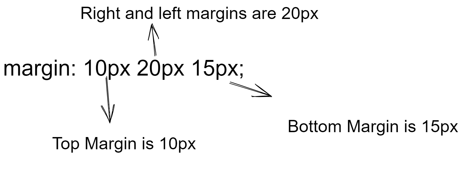
Example:
The Margin property has three values:
-
The above example shows a paragraph element that has a top margin of 10px, a right and left margin of 20px, and a bottom margin of 15px.
3.The margin shorthand property with two values:
margin: 10px 20px;Top and bottom margin is 10px
Right and left margin is 20px
Syntax:
             p{
                            margin: 10px 20px;
                            }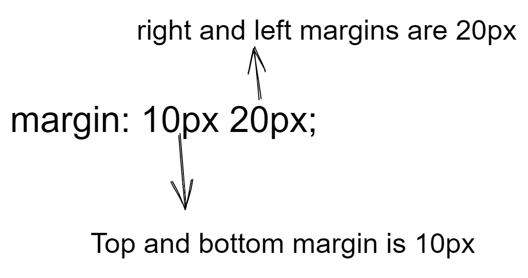
Example:
The Margin property has two values:
-
The above example shows a paragraph element that has a top and bottom margin value is 10px and a left and right margin value is 20px.
4.The margin shorthand property with one value:
margin: 10px;- All four margin values are 10px.
Syntax:
             p{
                margin: 10px;
            }
Example:
The Margin property has one value:
-
It sets the equal value of the top, right, bottom, and left margin of 10px.

5.The Height and Width
The CSS
heightandwidthproperties are used to set the height and width of an element.the
heightandwidthdescribes the dimensions of the actual content of the box (text, images etc.)
Syntax:
          div {
            height: 50px;
            width: 500px;
            border: 2px dotted #01a3a4;
          }
Example:
-
The height and width properties do not include padding, borders, or margins.
It sets the height/width of the area inside the padding, border, and margin of the element.

CSS Height and Width Values
The
heightandwidthproperties may have the following values:Auto -
This is the default value.
The browser calculates the height and width values.
Syntax -
          div{
          height: auto;
          width: auto;
          }
Length -
Defines the height/width values in px, cm, etc.
Syntax:
          div{
          height | width: numbered value in (px, cm, etc.)
          }
Percentage(%) - Defines the height/width in percent(%) of the containing block.
Syntax -
          div{
          height | width: numbered value in %;
          }
Initial -
Sets the height/width to its default value.
Syntax:
          div{
          height | width: initial;
          }
Inherit -
The height/width will be inherited from its parent value.
Syntax:
          div{
          height | width: inherit;
          }
CSS Height and Width Examples
Example - Width:
The below example program shows that a paragraph element will have a total width of 350px.
-
Explanation:
Here is the calculation:
320px (width)
+ 20px [(10px + 10px)(left + right padding)]
+ 10px [(5px + 5px)(left + right border)]
+ 0px (left + right margin)
\= 350pxThe total width of an element should be calculated like this:
Total element width = width + left padding + right padding + left border + right border + left margin + right margin
Example - Height:
The total height of an element should be calculated like this:
Total element height = height + top padding + bottom padding + top border + bottom border + top margin + bottom margin
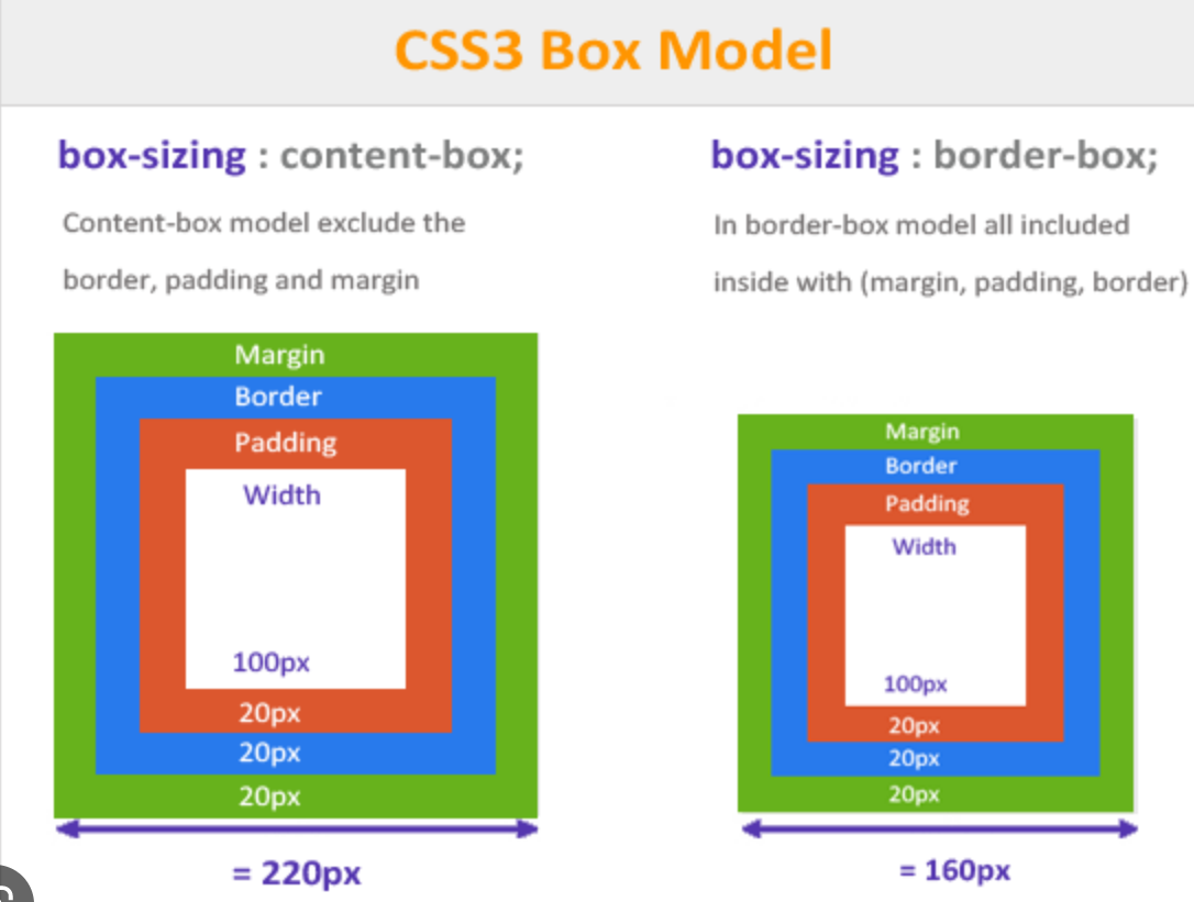
6.Box - Sizing
The CSS
box-sizingproperty allows us to include the padding and border in an element's total width and height.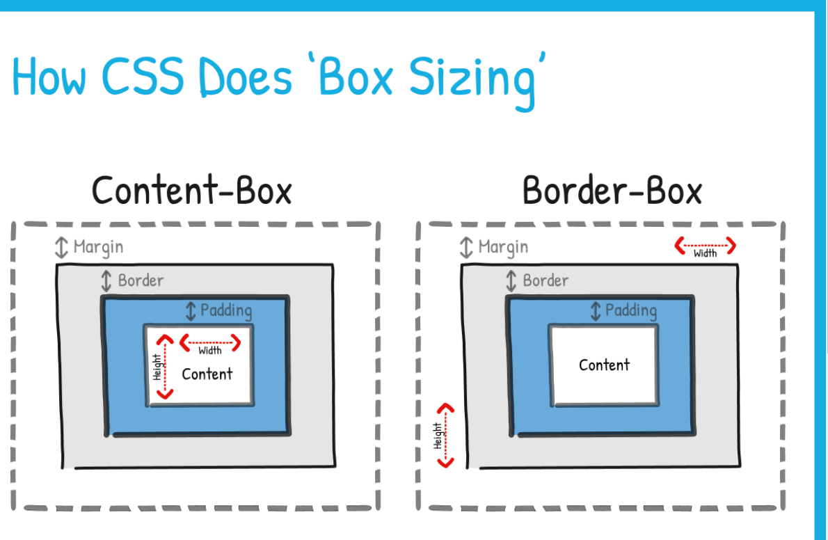
By default, when we specify the width or height of a box, the actual calculation that CSS comes to for the width or height of that box (its box sixe), is slightly different from what you might expect.
By default, CSS first calculates the height and/or width that you’ve set, and then, if there are padding or border values set on the box as well, it adds them to the ‘total’ box size after the fact.
This default method of measuring a box causes a problem. It effectively increases the real height or width that we end up with on the page, for the box.
A height and/or width that’s larger than the one we’ve set in our CSS.
Giving us a ‘box size’ that we might not expect.
Example -
If we set a 200 pixels width on a <div> box, like this:
-
This gives us this:

If we take a look at our box model pane, we can see this box’s ‘total’ width calculation:

As you can see, our ‘200px’ width only applies to our content area. The rest of the box is getting 10px of padding on each side (200px + 20px = 220px) and 5px of the border on each side (220px + 10px = 230px).
So in the end, even though we have set a 200px width for our box. What we end up with from our box model calculation, is a ‘real’ box width (or box-sizing) of 230px.
This is how CSS calculates our box size (total width and/or height) by default.
We would expect our box size (both height and width) to match whatever we set our height and/or width to be within our CSS.
To achieve the result that we expect from our box, ensure our box dimensions (our height and width) remain as we have set them. We can set a value of ‘border-box’ to our box-sizing property.
This gives CSS the to set the height and/or width of our entire box to be from border to border. Rather than just within our content area.
This ensures that our box’s total size does not ever exceed the height/width that we’ve set. No matter what padding and border values we apply to it.
Let’s take a look at how this would work, by applying the box-sizing property to our previous example <div> box:
-
This gives us this:

If you glance over to the previous example, you will notice that the output we have here is a bit smaller.
We can see this more clearly with our box model pane:

As you can see, we still have our padding and border measurements on the box. But what has changed is the measurement within the content area. With the box-sizing property, with the ‘border-box’ value applied, we now have a box that starts measuring its height and/or width FROM its border. Not from its content area.
Our box’s ‘content area’ will now simply change size to accommodate any other (padding or border) size changes. Applying “box-sizing: border-box;” to our <div> has shrunk our ‘content area’ to make sure our ‘total’ box size, including padding and border, comes to the 200px that we’ve set.
Our height and width are now ‘locked-in’ and ‘fixed’, allowing us to get the exact sized box that we’ve set within our CSS.
The box-sizing property also accepts another value: content-box.
This value reverts the box back to its default behaviour in CSS. Expanding its final measurements beyond the set height/width if the padding and border make it do so.
With the ‘border-box’ value, the height and/or width that we set becomes the height/width of the entire box. With the ‘content-box’ value, however, the height/width that we set will be the height/width of the content area of the box only. Any additional padding or border measurements will be added to the overall final box size.
This is the default setting that we originally saw in the first <div> box example.
Now that we’ve gotten ourselves a decent grasp of the box model, and the different ways in which we can manipulate it.