CSS Grid Layout

Grid Layout in CSS
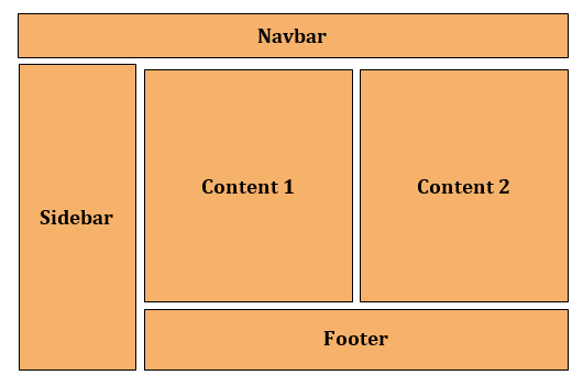
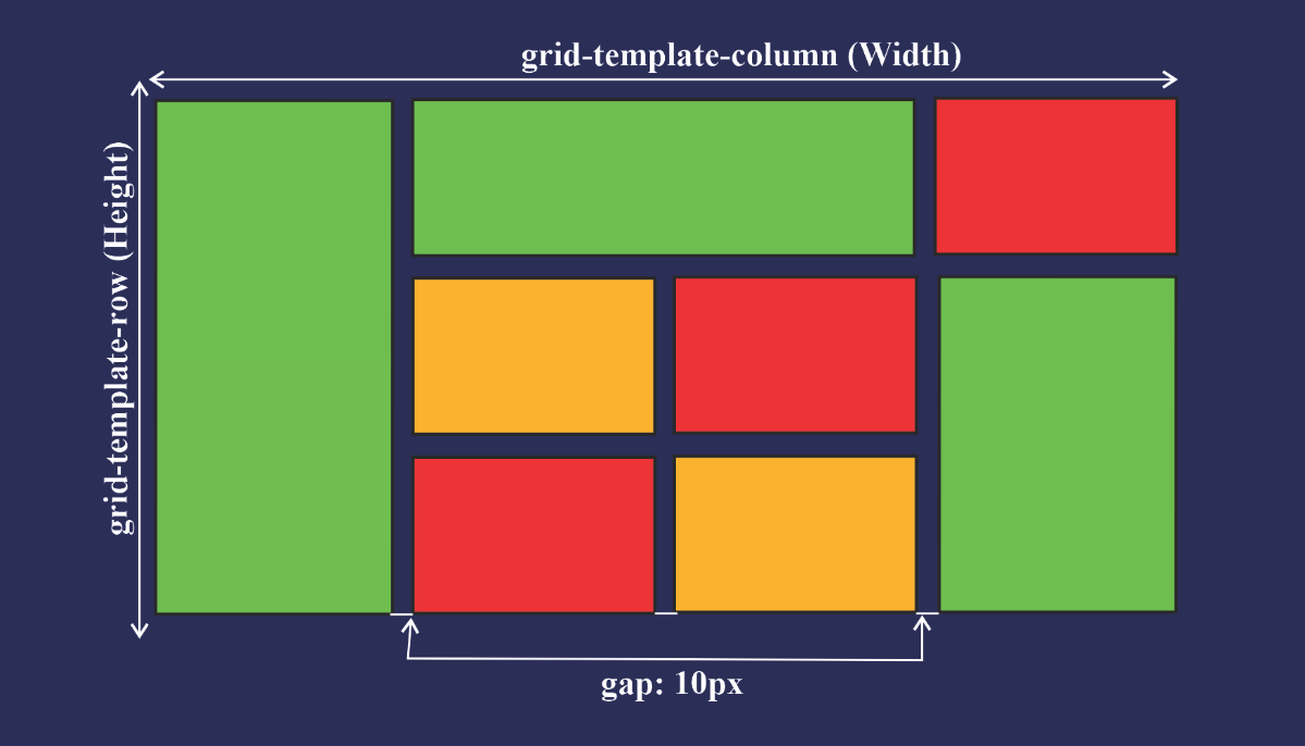
Grid is a CSS layout model that allows its users to arrange elements appearing on a website into various rows and columns.
This model partitions a web page into sections and aligns elements without having to go through the trouble of using positioning and floats.
A grid positions elements concerning either the web page or other elements present on the web page.
Below we have shown a visual representation of a CSS grid layout.
A grid layout model works with all the latest browsers.
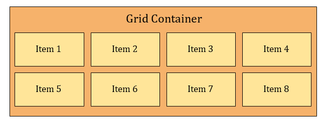
It consists of two components which are
Grid Container and
Grid Items.
The main difference between Flexbox and CSS Grid is:
- Flexbox is a one-dimensional layout system, while CSS Grid is a two-dimensional grid-based layout system.

Grid Container
A Grid container is a parent element that holds grid items placed within rows, and columns.
To make an element adopt the behaviour of a grid container set its display property to either grid or inline grid.
Grid Items
A Grid item is a child element that is present inside a grid container.
Inside a container by default, there is one item present for each column, in each row.
However, you can span grid items across numerous rows and columns.
Here is a graphical representation of the grid container, and grid items.
CSS Grid Properties
Grid Container Property
Grid Item Property

#Grid Container Properties
This is a CSS grid property that houses the grid items/elements.
Properties for the Parent (Grid Container) are:
display
grid-template-columns
grid-template-rows
grid-template-areas
grid-template
grid-column-gap
grid-row-gap
grid-gap
justify-items
align-items
place-items
justify-content
align-content
place-content
grid-auto-columns
grid-auto-rows
grid-auto-flow
grid
1.Display Property
Defines the element as a grid container and establishes a new grid formatting context for its contents.
We implement the CSS grid container property by setting the container to a
displayproperty ofgridorin-line grid.Values -
grid– generates a block-level grid.inline-grid– generates an inline-level grid.
Syntax -
             .container {
            display: grid | inline-grid;
            }

2.Grid Template Columns Property
This is a property used to set each column’s width. It can also define how many columns you want to set for your project.
We can implement the CSS gird column property using
grid-template-column.The vertical lines in a grid within which items are placed are regarded as columns in a grid. A grid system can have at least two and at most twelve or more columns.
Syntax:
            .container{
            grid-template-columns: 100px auto 100px;
            }
Example - 1:
-
The code above shows that we have three columns. The width of columns one (the first column) and three (the third column) are set to
100px. The width of column two (the middle column) is set toauto.This means that as the size of your screen increases, columns one and three take
100pxof the screen width, while column two takes the remaining width of the screen (which isauto).Example - 2:
            .container{
            grid-template-columns: 90px 50px 120px;
            }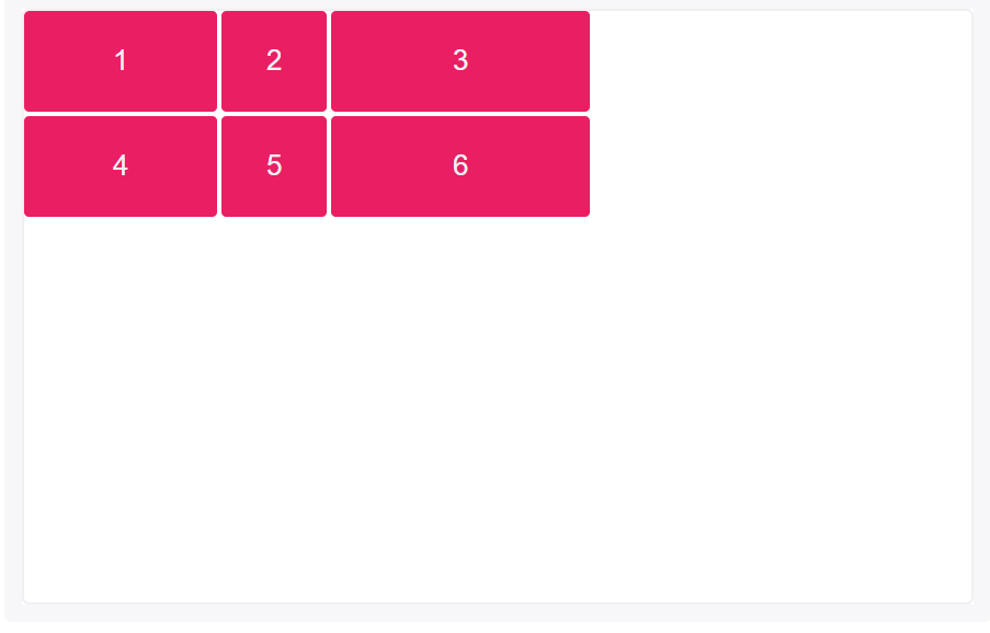
A column track is created for each value specified for
grid-template columns.Items 4, 5 and 6 were placed on a new row track because only 3 column track sizes were defined; and because they were placed in column tracks 1, 2 and 3, their column sizes are equal to items 1, 2 and 3.
Grid items 1, 2 and 3 have fixed widths of
90px,50pxand120pxrespectively.Example - 3:
            .container{
            grid-template-columns: 1fr 1fr 2fr;
            }
The
frunit helps create flexible grid tracks. It represents a fraction of the available space in the grid container (works like Flexbox’s unitless values).In this example, items 1 and 2 take up the first two (of four) sections while item 3 takes up the last two.
Example - 4:
            .container{
            grid-template-columns: 3rem 25% 1fr 2fr;
            }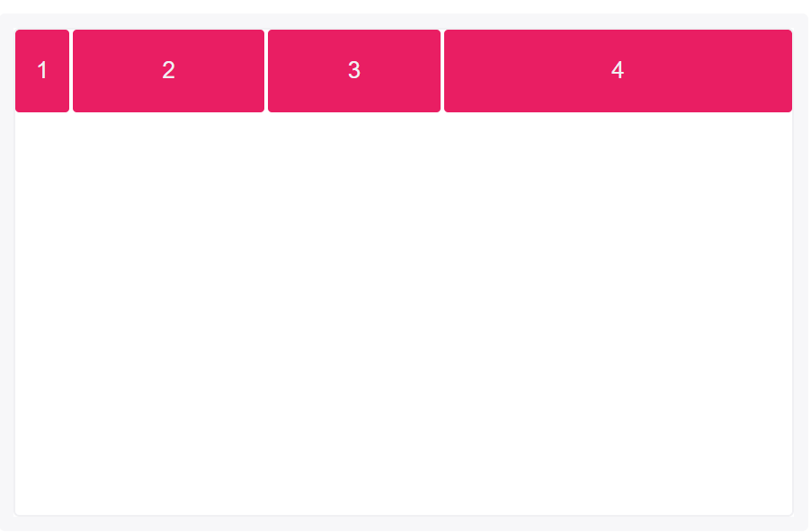
fris calculated based on the remaining space when combined with other length values.In this example,
3remand25%would be subtracted from the available space before the size offris calculated as below:
1fr = [(width of the grid) - (3rem) - (25% of the width of the grid)] / 3
3.Grid Template Rows Property
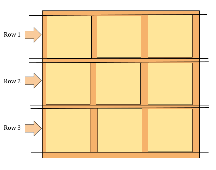
The horizontal lines in a grid within which items are placed are regarded as rows in a grid. A grid system can have numerous rows.
Syntax:
            .container{
            display: grid;
            grid-template-rows: 50px 100px;
            }
Example:
A row track is created for each value specified for
grid-template rows.Track size values can be any non-negative, length value (
px,%,em, etc.)Items 1 and 2 have fixed heights of
50pxand100px.Because only 2-row tracks were defined, the heights of items 3 and 4 are defined by the contents of each.

-
4.Grid Template Areas Property
The
grid-template-areasproperty specifies areas within the grid layout.We can name grid items by using the grid-area property, and then reference the name in the
grid-template-areasproperty.Each area is defined by apostrophes. Use a period sign to refer to a grid item with no name.
Syntax:
                                  .item1 {
                                    grid-area: myArea;
                                  }
                                  .grid-container {
                                    display: grid;
                                    grid-template-areas:
                                      'myArea myArea . . .'
                                      'myArea myArea . . .';
                                  }
Example:
-
Specify two rows, where "item1" spans the first two columns in the first two rows (in a five columns grid layout).
To specify two rows, make one more sequence, Each row is defined by apostrophes (' '). "myArea" will span the first two columns, in the first two rows.
5.Grid Template Property
A Shorthand for setting grid-template-rows, grid-template-columns, and grid-template-areas in a single declaration.
Grid-template is another way of representing the grid-template-column and grid-template-row.
Syntax:
            .container{
        display: grid;
        grid-template: 50px 50px / 100px auto 100px;
        }
The code above will give you the same result as
grid-template-columnandgrid-template-row.To use the
grid-templateproperty, you will have to assign the value to the row first before assigning the column's value, just like the code above. The50px 50pxis for the row while100px auto 100pxis for the column.A way to remember this is by thinking of the letter L:

Example:
-
A grid with a column of 100px auto 100px and a row of 50px 50px.
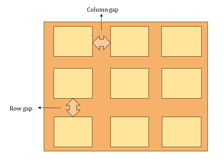
6.Grid Coloum Gap Property
It is a grid property that assigns a space between two or more columns in a container that is a grid layout.
We can do this by using the
column-gapproperty and giving it a value.Value:
Length - Any legal length value, like px or %.
0 is the default value.
Syntax:
        .container{
        display: grid;
        column-gap: 20px;
        }
From the code above, we can see that a gap of
20pxwas assigned to the column.-
A grid with a column of 100px auto 100px and column-gap of 20 pixels.
7.Grid Row Gap Property
Grid row gap property is a CSS property that assigns a space between two or more rows in a container that is a grid layout.
We can do this by using the
row-gapproperty and giving it a value.Value:
Length - Any legal length value, like pixels (px) or percentages (%).
0 is the default value.
Syntax:
        .container{
        display: grid;
        row-gap: 50px;
        }
Example:
-
A grid with a column of 100px auto 100px and row-gap of 50 pixels.
8.Grid Gap Property
The area between each row and column is referred to as a gap.
Grid gaps are only created in between columns and rows, and not along the edge of the grid container.
The grid-gap property defines the size of the gap between the rows and columns in a grid layout, and is a shorthand property for the following properties:
row-gap
column-gap
The
column-gapandrow-gapproperties create gutters between columns and rows.If two values are specified, the first represents
row-gapand the secondcolumn-gap.Syntax:
.container{
display: gird;
gap: 20px;
}
Example:
-
From the above example, we can see that a
gapof20pxwas set to both the columns and rows of the container making them equally spaced.
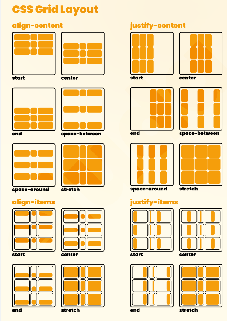
9.Grid Justify-Items Property
Aligns grid items along the inline (row) axis (as opposed to
align-itemsthat align along the block (column) axis). This value applies to all grid items inside the container.Syntax:
  .container{
    display: grid;
    justify-items: start | end | center | stretch;
  }
1.Grid Justify Items - START:
Aligns items to be flush with the start edge of their cell.
Syntax:
        .container {
        justify-items: start;
        }
-

2. Grid Justify Items - END:
Aligns items to be flush with the end edge of their cell.
Syntax:
                                  .container {
                                    justify-items: end;
                                  }
Example - 2:
-

3. Grid Justify Items - CENTER:
Aligns items in the center of their cell.
Syntax:
                                  .container {
                                    justify-items: center;
                                  }
Example:
-

4.Grid Justify Items - STRETCH:
Fills the whole width of the cell (this is the default).
Syntax:
                                  .container {
                                    justify-items: stretch;
                                  }
Example:
-

10.Grid Align-Items Property
Aligns grid items along the block (column) axis (as opposed to justify-items which aligns along the inline (row) axis). This value applies to all grid items inside the container.
Values:
stretch– fills the whole height of the cell (this is the default).start– aligns items to be flush with the start edge of their cell.end– aligns items to be flush with the end edge of their cell.center– aligns items in the center of their cell.baseline– align items along text baseline. There are modifiers tobaseline—first baselineandlast baselinewhich will use the baseline from the first or last line in the case of multi-line text.
Syntax:
                              .container {
                              display: grid;
                                align-items: start | end | center | stretch;
                              }
Example - 1:
.container { align-items: start; }-

Example - 2:
.container { align-items: end; }-

Example - 3:
.container { align-items: center; }-

Example - 4:
.container { align-items: stretch; }-

11.Grid Place-Items Property
place-itemssets both thealign-itemsandjustify-itemsproperties in a single declaration.Values:
<align-items>/<justify-items>– The first value setsalign-items, the second valuejustify-items. If the second value is omitted, the first value is assigned to both properties.
This can be very useful for super quick multi-directional centering.
Syntax:
.center { display: grid; place-items: center center; }-
12.Grid Justify-Content Property
This is a grid property that you use in positioning items (columns and rows) horizontally in a container. It displays how the web browser positions the spaces around the items (columns and rows).
It supports the following properties:
startendcenterspace-aroundspace-betweenspace-evenly
Syntax:
                              .container{
                              display: grid;
                              justify-content: start | end | center | space-around | space-evenly |   space-between | baseline | stretch;
                              }
1. Justify Content - START :
This positions the items at the left side of the browser and can be executed with the following code:
Syntax:
                              .container{
                              display: grid;
                              justify-content: start;
                              }
Example:
-

2. Justify Content - END :
This positions the items at the right side of the browser and can be executed with the following code:
Syntax:
                              .container{
                              display: grid;
                              justify-content: end;
                              }
Example:
-

3. Justify Content - CENTER :
This positions the items at the center of the browser and can be executed with the following code:
Syntax:
                              .container{
                              display: grid;
                              justify-content: center;
                              }
Example:
-

4. Justify Content - SPACE-AROUND:
This property distributes the items in the container evenly, where each item in the container has an equal amount of space from the next container.
This code can be executed like this:
Syntax:
                              .container {
                                justify-content: space-around;
                              }
Example:
-

4. Justify Content - SPACE-BETWEEN:
Just like the
space-aroundproperty,space-betweendistributes the items in the container evenly, where each item in the container has an equal amount of space from the next one in the container. It takes up the entire width of the container.This code can be executed like this:
Syntax:
                              .container {
                                justify-content: space-between;
                              }
Example:
-

6. Justify Content - SPACE-EVENLY:
Just as the name states, this property distributes the items in the container evenly, where each item in the container has an equal amount of space from the next one in the container.
This code can be executed like this:
Syntax:
                              .container {
                                justify-content: space-evenly;
                              }
Example:
-

13.Grid Align-Content Property
Align-contentis the opposite ofjustify-content. You use thealign-contentproperty in positioning items vertically in a container.Just like
justify-content, thealign-contentproperty has six possible values:Startendcenterspace-aroundspace-betweenspace-evenly
Syntax:
                          .container {
                            align-content: start | end | center | stretch | space-around | space-between | space-evenly;
                          }
1. Align Content - START :
This positions the items at the top of the browser and can be executed with the following code:
Syntax:
                            .container {
                              align-content: start;
                            }
Example:
-

2. Align Content - END:
This positions the items at the bottom of the browser and can be executed with the following code:
Syntax:
                          .container {
                            align-content: end;
                          }
Example:
-

3. Align Content - CENTER:
This positions the items at the center of the browser and can be executed with the following code:
Syntax:
      .container {
      align-content: center;
      }
Example:

4. Align Content - SPACE-AROUND
This property distributes the items along the side of the container evenly, where each item in the container has an equal amount of space from the next one vertically.
This code can be executed like this:
Syntax:
                          .container{
                          align-content: space-around;
                          }
Example:
-

5. Align Content - SPACE-BETWEEN:
Just like the
space-aroundproperty,Space-betweendistributes the items in the container evenly, where each item in the container has an equal amount of space from the next one in the container and takes up the entire width of the container in the vertical direction.This code can be executed like this:
Syntax:
                          container {
                            align-content: space-between;
                          }
Example:
-

6. Align Content - SPACE-EVENLY:
Just as the name states, this property distributes the items in the container evenly, where each item in the container has an equal amount of space from the next one vertically.
This code can be executed like this:
Syntax:
                          .container {
                            align-content: space-evenly;
                          }
Example:
-

14.Grid Place-Content Property
Place Content sets both the
align-contentandjustify-contentproperties in a single declaration.Values:
<align-content>/<justify-content>– The first value setsalign-content, the second valuejustify-content. If the second value is omitted, the first value is assigned to both properties.
#Grid Item Properties
A grid container contains grid items.
By default, a container has one grid item for each column, in each row, but you can style the grid items so that they will span multiple columns and/or rows.
Properties for the Child (Grid Items) are:
grid-column-start
grid-column-end
grid-row-start
grid-row-end
grid-column
grid-row
grid-area
justify-self
align-self
place-self
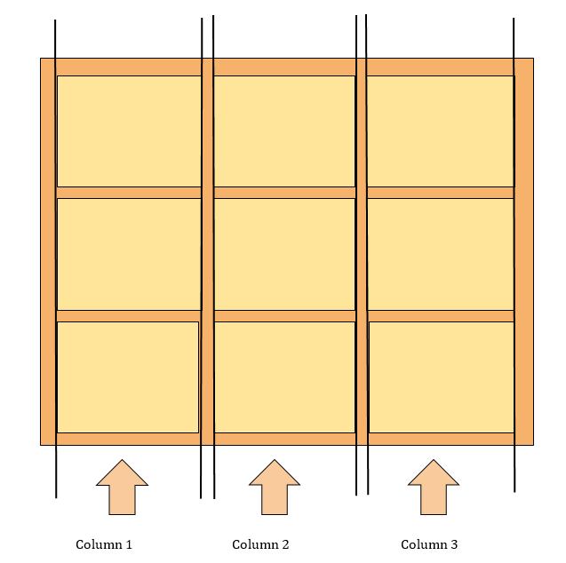
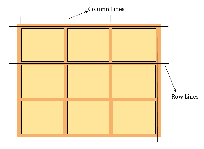
Lines in Grid:
Grid lines are essentially lines that represent the start of, the end of, or between column and row tracks.
Each line, starting from the start of the track and in the direction of the grid, is numbered incrementally starting from 1.
The lines between each row is referred to as row lines, whereas, the lines between each column is referred to as column lines.
1.Grid Column Start Property
The Grid Column Start property defines on which column line the item will start.
Specifies on which column to start displaying the item.
Syntax:
Make "item1" start on column 2
                      .item1 {
                        grid-column-start: 2;
                      }
Example:
-
2.Grid Column End Property
The Grid Column End property defines how many columns an item will span, or on which column line the item will end.
Specifies which column line to stop displaying the item, or how many columns to span.
Syntax:
Make "item1" span 3 columns.
                #item1{
                grid-column-end: span 3;
                }
Example:
-
3.Grid Column Property
The Grid Column property specifies a grid item's size and location in a grid layout, and is a shorthand property for the following properties:
grid-column-start
grid-column-end
If two values are specified, the first value corresponds to
grid-column-startand the secondgrid-column-end, and must be separated by a forward slash/.Syntax:
Make "item1" start on column 1 and span 2 columns.
                      .item1 {
                        grid-column: 1 / span 2;
                      }
Example:
                      .items1{
                      grid-column: 1 / 4;
                      }
-
Set a grid item to span more than one column track by setting
grid-column-endto a column line number that is more than one column away fromgrid-column-start.
4.Grid Row Start Property
The
grid-row-startproperty defines on which row-line the item will start.Specifies on which row to start displaying the item.
Syntax:
Make "item1" start on row 2.
                      .item1 {
                        grid-row-start: 2;
                      }
Example:
-
5.Grid Row End Property
The Grid Row Start property defines how many rows an item will span, or on which row line the item will end.
Specifies which row line to stop displaying the item, or how many rows to span.
Syntax:
Make "item1" span 3 rows.
                      .item1 {
                        grid-row-end: span 3;
                      }
Example:
-
6.Grid Row Property
The Grid Row property specifies a grid item's size and location in a grid layout, and is a shorthand property for the following properties:
grid-row-start
grid-row-end
If two values are specified, the first value corresponds to
grid-row-startand the secondgrid-row-end, and must be separated by a forward slash/.Syntax:
Make "item1" start on row 1 and span 2 rows:
                      .item1 {
                        grid-row: 1 / span 2;
                      }
Example:
                      .item1 {
                        grid-row: 1 / 4;
                      }
-
Grid items can also span across multiple row tracks by setting
grid-row-endto more than one row track away.
7.Grid Area Property
The Grid Area property specifies a grid item's size and location in a grid layout, and is a shorthand property for the following properties:
grid-row-start
grid-column-start
grid-row-end
grid-column-end
The grid-area property can also be used to assign a name to a grid item. Named grid items can then be referenced to by the grid-template-areas property of the grid container.
Syntax:
Make "item1" start on row 2 column 1, and span 2 rows and 3 columns.
                      .item1 {
                        grid-area: 2 / 1 / span 2 / span 3;
                      }
Example - 1:
                    .item1{
              grid-area: 2 / 2 / 5 / 4;
                    }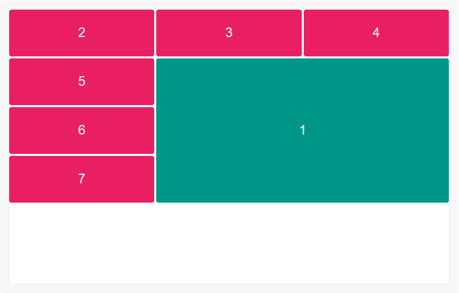
-
Shorthand properties
grid-rowandgrid-columncan also be used to position and span grid items in more than one row or column.Example - 2:
                    .item1{
              grid-area: 2 / span 2 / span 3 / span2;
                    }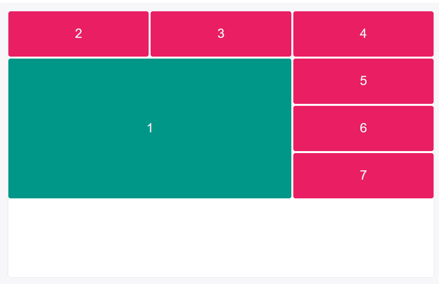
-
The keyword
span, followed by the # of columns or rows to span, can also be used.
8.Grid Justify Self Property
Aligns a grid item inside a cell along the inline (row) axis (as opposed to
align-selfwhich aligns along the block (column) axis). This value applies to a grid item inside a single cell.It supports the following properties:
start
end
center
stretch
Syntax:
                  .item {
                    justify-self: start | end | center | stretch;
                  }
1.Grid Justify Self-START Property :
Aligns the grid item to be flush with the start edge of the cell.
Syntax:
                  .item-a {
                    justify-self: start;
                  }
Example:
-

2.Grid Justify Self-END Property :
Aligns the grid item to be flush with the end edge of the cell.
Syntax:
                  .item-a {
                    justify-self: end;
                  }
Example:
-

3.Grid Justify Self-CENTER Property :
Aligns the grid item in the center of the cell.
Syntax:
                  .item-a {
                    justify-self: center;
                  }
Example:
-

4.Grid Justify Self-STRETCH Property :
Fills the whole width of the cell (this is the default).
Syntax:
                  .item-a {
                    justify-self: stretch;
                  }
Example:
-

9.Grid Align Self Property -
Aligns a grid item inside a cell along the block (column) axis (as opposed to
justify-selfwhich aligns along the inline (row) axis). This value applies to the content inside a single grid item.It supports the following properties:
start
end
center
stretch
Syntax:
                  .item {
                    align-self: start | end | center | stretch;
                  }
1.Grid Align Self-START Property :
Aligns the grid item to be flush with the start edge of the cell.
Syntax:
                  .item-a {
                    align-self: start;
                  }
Example:
-

2.Grid Align Self-END Property :
Aligns the grid item to be flush with the end edge of the cell
Syntax:
                  .item-a {
                    align-self: end;
                  }
Example:
-

3.Grid Align Self-CENTER Property :
Aligns the grid item in the center of the cell.
Syntax:
                  .item-a {
                    align-self: center;
                  }
Example:
-

4.Grid Align Self-STRETCH Property :
Fills the whole height of the cell.
This is the default value of Align Self.
Syntax:
                  .item-a {
                    align-self: stretch;
                  }
Example:
-

10.Grid Place Self Property
Place Self sets both the
align-selfandjustify-selfproperties in a single declaration.Values:
auto– The “default” alignment for the layout mode.<align-self>/<justify-self>– The first value setsalign-self, the second valuejustify-self.If the second value is omitted, the first value is assigned to both properties.
Syntax:
                .item-a {
                  place-self: center;
                }
Example - 1:
                .item-a {
                  place-self: center stretch;
                }
Example - 2:
                .item-1 {
                place-self: center;
                }
-
Item is positioned at the center of the row and column axes.


