CSS Media Queries

Media Queries in CSS
Media Queries are used to make the websites responsive.
The media query is used to hide/show an element when printing web pages.
Media queries can modify the appearance (and even behavior) or a website or app based on a matched set of conditions about the user’s device, browser or system settings.
Syntax:

Media queries can be used to check many things, such as:
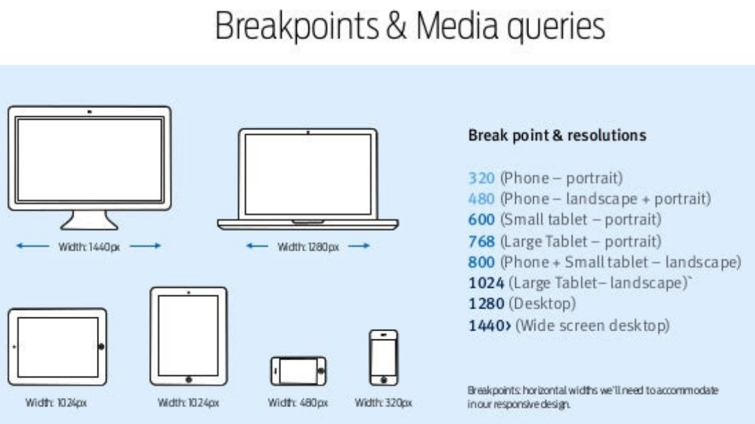
width and height of the viewport
width and height of the device
orientation (is the tablet/phone in landscape or portrait mode?)
resolution
Using media queries is a popular technique for delivering a tailored style sheet to desktops, laptops, tablets, and mobile phones (such as iPhone and Android phones).

CSS Media queries are a way to target browsers by certain characteristics, features, and user preferences, then apply styles or run other code based on those things.
Perhaps the most common media queries in the world are those that target particular viewport ranges and apply custom styles, which birthed the whole idea of responsive design.

And here’s a summary along with further details on what’s in the image:
@media– The CSS at-rule that indicates that you’re writing a media query.screen– One of the available media types to identify which devices should the media query should target. This is optional if you’re not using thenotandonlyoperators.and– A media query modifier, also called a logical operator, that helps you conditionally target certain devices and media features.(min-width: 900px)– One of numerous media features and values available to target specific device sizes, device types, device capabilities, etc.article { ... }– The selectors and CSS rules, nested inside opening and closing curly braces, indicating what CSS rules you want to apply to your media queries.
Media
The first ingredient in a media query recipe is the
@mediarule itself, which is one of many CSS at-rules.The type of media that a site is viewed with, what features that media type supports, and operators that can be combined to mix and match simple and complex conditions alike.
Syntax:
            @media [media-type] ([media-feature]) {
              /* Styles! */
            }
Media Types in Media Queries
The media types describe the category of device you want the styles to apply to.
Media types are defined with one of four keywords are given below:
all
print
screen
speech
1.All
all– Indicates that you want to target all devices, with no exceptions. Used for all media-type devices.Used for printers.
2.Print
print– Targets devices that send output to a print display like the “Print Preview” window in a web browser.
3.Screen
screen– This is the opposite ofprint, targeting all devices that don’t fall under theprintcategory.Used for computer screens, tablets, smartphones etc.
4.Speech
speech- Used for screenreaders that "reads" the page out loud.Syntax:
            @media screen {
              /* Styles! */
            }
Media Features in Media Queries
Media features improve the use of media types, allowing you to use a more fine-grained approach to applying your styles in certain circumstances.
The most commonly used and best-supported media features are:
1.Width
Width of the viewport including width of the scrollbar.
Also allows the use of the
min-andmax-prefixes.Syntax:
            @media (width: 800px) { ... }
            @media (min-width: 360px) { ... }
            @media (max-width: 1400px) { ... }
2.Height
The height of the viewport.
Accepts
min-andmax-prefixes.Syntax:
            @media (height: 500px) { ... }
            @media (min-height: 400px) { ... }
            @media (max-height: 400px) { ... }
3.Orientation
Orientation of the viewport.
Syntax:
            @media (orientation: portrait) { ... }
            @media (orientation: landscape) { ... }
4.Display-Mode
The display mode of the application, as specified in the web app manifest.
Syntax:
            @media (display-mode: fullscreen) { ... }
            @media (display-mode: standalone) { ... }
            @media (display-mode: minimal-ui) { ... }
            @media (display-mode: browser) { ... }
5.Aspect-Ratio
Based on the specified aspect ratio, indicated by two positive integers separated by a slash.
Syntax:
@media (aspect-ratio: 16/9) { ... }
6.Color
A number of bits per color component of the output device, or zero if the device doesn’t use color.
Also allows the use of
min-andmax-prefixes. No value indicates you’re targeting any color device.Syntax:
            @media (color) { ... }
            @media (color: 8) { ... }
            @media (min-color: 8) { ... }
            @media (max-color: 16) { ... }
7.Grid
Detect if the device uses either a grid-based screen (e.g. a text-based terminal) or a bitmap-based screen (like most modern computers, tablets, and smartphones).
A value of
1means grid-based, a value of0means bitmap-based.Syntax:
            @media (grid: 0) { ... }
            @media (grid: 1) { ... }
8.Monochrome
Bits per pixel in the device’s monochrome frame buffer.
Syntax:
            @media (monochrome: 0) { ... }
            @media (monochrome) { ... }
9.Resolution
The pixel density of the output device.
Can also use the
min-andmax-prefixes.Syntax:
            @media (resolution: 72dpi) { ... }
            @media (min-resolution: 300dpi) { ... }
            @media (max-resolution: 150dpi) { ... }
10.Any-Hover
Whether or not there is hover functionality present.
Syntax:
            @media (any-hover: none) { ... }
            @media (any-hover: hover) { ... }
11.Any-Pointer
Whether there is a pointing device present and how accurate it is.
Syntax:
            @media (any-pointer: none) { ... }
            @media (any-pointer: course) { ... }
            @media (any-pointer: fine) { ... }
12.Color-Gamut
Approximate range of colors supported by the device.
Syntax:
            @media (color-gamut: srgb) { ... }
            @media (color-gamut: p3) { ... }
            @media (color-gamut: rec2020) { ... }
13.Color-Index
The number of entries in the output device’s color lookup table.
Also allows the use of
min-andmax-prefixes.No value indicates you’re targeting any color index.
Syntax:
            @media (color-index) { ... }
            @media (min-color-index: 15000) { ... }
            @media (max-color-index: 30000) { ... }
14.Hover
If the user can hover over elements.
Syntax:
            @media (hover: none) { ... }
            @media (hover: hover) { ... }
15.Overflow-Block
How the device handles content that overflows along the block axis.
Syntax:
            @media (overflow-block: none) { ... }
            @media (overflow-block: scroll) { ... }
            @media (overflow-block: optional-paged) { ... }
            @media (overflow-block: paged) { ... }\
16.Overflow-Inline
How the device handles content that overflows the viewport along the inline axis.
Syntax:
            @media (overflow-inline: none) { ... }
            @media (overflow-inline: scroll) { ... }
17.Pointer
If there is a pointer present on the device.
Syntax:
            @media (pointer: none) { ... }
            @media (pointer: coarse) { ... }
            @media (pointer: fine) { ... }
18.Scan
If the device is interlaced (like some plasma TVs) or progressive (like most computer monitors).
Syntax:
            @media (scan: interlace) { ... }
            @media (scan: progressive) { ... }
19.Update
That is update frequency.
Syntax:
            @media (update: none) { ... }
            @media (update: slow) { ... }
            @media (update: fast) { ... }
Modifiers (Logical Operators) in Media Queries
Media queries support logical operators like many programming languages so that we can match media types based on certain conditions.
The
@mediarule is itself a logical operator that is stating that “if” the following types and features are matches, then do some stuff.A modifier is a single keyword that affects the meaning of the media feature that follows it.
The available modifiers are:
1.The not modifier
When this modifier precedes a media feature, it excludes the targeted devices from the media query (similar to how CSS’s
:not()selector works).Example:
            @media not print {
              article {
                padding: 1rem 3rem;
              }
            }
The above media query would target all devices that aren’t print devices, thus the above would be equivalent to using
screenwith no modifier.
2.The only modifier
This modifier is specifically for helping legacy browsers correctly parse a media query.
As the spec explains: “The
onlykeyword does not affect the media query’s result, but will cause the media query to be parsed by legacy user agents as specifying the unknown media type “only,” and thus be ignored.”Example:
            @media only screen {
              article {
                padding: 1rem 3rem;
              }
            }
3.The and modifier
Used to combine multiple media features in a single media query.
Example:
            @media screen and (min-width: 800px) {
              article {
                padding: 1rem 3rem;
              }
            }
The above targets all non-print devices that have a width equal to or greater than 800px.
4.The , modifier
The comma allows you to include a list of media queries that works similarly to a logical
oroperator.Example:
            @media screen and (min-width: 800px), print and (min-width: 1000px) {
              article {
                padding: 1rem 3rem;
              }
            }
The styles in the above media query will target either of the two media queries separated by a comma.
This is similar to how the comma works when using CSS selectors.
Example Program on Mobile Responsive
In this example, we use media queries to create a responsive website, that varies in design on different screen sizes.


