Flex Boxes in CSS

Flex Boxes in CSS
The CSS Flexbox is used to make the elements behave predictably when they are used with different screen sizes and different display devices.
It provides a more efficient way to layout, aligns and distribute space among items in the container.
It is mainly used to make CSS capable to change its item's width and height to best fit all available spaces. It is preferred over the block model.
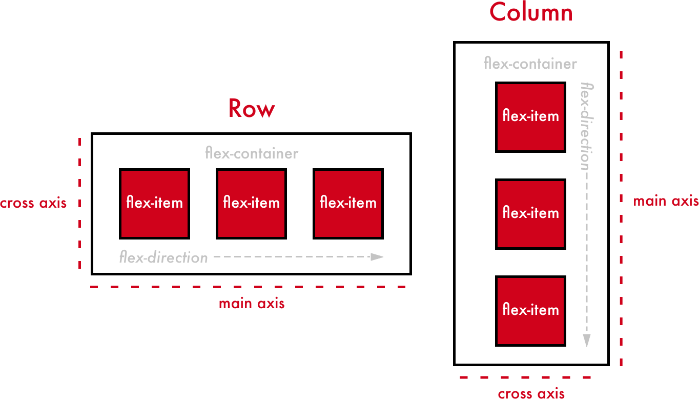
In Flexboxes, mainly we work with two axes. They are
- I. Main-axis - The main axis of a flex container is the primary axis along which flex items are laid out. Beware, it is not necessarily horizontal; it depends on the
flex-directionproperty.
- I. Main-axis - The main axis of a flex container is the primary axis along which flex items are laid out. Beware, it is not necessarily horizontal; it depends on the
II. Cross-axis - The axis perpendicular to the main axis is called the
cross-axis. Its direction depends on the main axis direction.
The CSS Flexbox contains flex containers and flex items.
(1)Flex Container
Flex container specifies the properties of the parent.
It is declared by setting the display property of an element to either flex or inline-flex.
It enables a flexible context for all its direct children.
Syntax:
.container {
  display: flex; /* or inline-flex */
}
/* Here .container is Parent class
The Flex Container Properties are
flex-direction
flex-wrap
flex-flow
justify-content
align-items
align-content
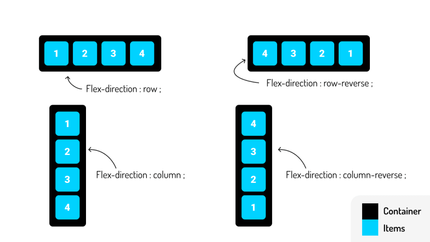
1.Flex Direction
The
flex-directionproperty is used to specify the direction of the flexible items inside a flex container. Its default value is row.Syntax:
.container{
display: flex;
flex-direction: row | row-reverse | column | column-reverse;
}
/* here .container is class */
I.Flex-direction - row
The
rowvalue stacks the flex items horizontally (from left to right).Syntax:
                            .container{
                            display: flex;
                            flex-direction: row;
                            }
Example:
-
II.Flex-direction: row-reverse
The
row-reversevalue stacks the flex items horizontally (but from right to left).Syntax:
                            .container{
                            display: flex;
                            flex-direction: row-reverse;
                            }
Example:
-
III.Flex-direction - column
The
columnvalue stacks the flex items vertically (from top to bottom).Syntax:
                            .container{
                            display: flex;
                            flex-direction: column;
                            }
Example:
-
IV.Flex-direction: column-reverse
The
column-reversevalue stacks the flex items vertically (but from bottom to top).Syntax:
                            .container{
                            display: flex;
                            flex-direction: column-reverse;
                            }
Example:
-
The Image with Flex direction Properties:
2.Flex Wrap
By default, flex items will all try to fit onto one line. You can change that and allow the items to wrap as needed with this property.
Wrap means to bind/fold everything.
it specifies whether the flex items should wrap or not if there is not enough room for them on one flex line.
SYNTAX:
                              .container{
                              dispaly: flex;
                              flex-wrap: wrap | nowrap | wrap-reverse;
                              /* Here .conatiner is class name*/
The Image with Flex Wrap Properties:

I.Flex-wrap - wrap
The
wrapvalue specifies that the flex items will wrap if necessary.It is getting wrapped inside the box/window.
Syntax:
                            .container{
                            display: flex;
                            flex-wrap: wrap;
                            }
Example:
-
II.Flex-wrap - nowrap
The
nowrapvalue specifies that the flex items will not wrap.It is the default value in flex-wrap.
Syntax:
                            .container{
                            display: flex;
                            flex-wrap: nowrap;
                            }
Example:
-
III.Flex-wrap - wrap-reverse
The
wrap-reversevalue specifies that the flexible items will wrap if necessary, in reverse order.Syntax:
                            .container{
                            display: flex;
                            flex-wrap: wrap-reverse;
                            }
Example:
-
The Image with Flex Wrap Properties:

3.Flex-Flow
The
flex-flowproperty is a shorthand property for setting both theflex-directionandflex-wrapproperties.SYNTAX:
                     .container{
                        display: flex;
                        flex-flow: row|row-reverse|column|column-reverse          wrap|nowrap|wrap-reverse;
4.Justify-Content
it is used to align the flex items horizontally when the items do not use all available space on the main axis.
The
justify-contentproperty is used to align the flex items:Syntax:
                              .container{
                              display: flex;
                              justify-content: flex-start | flex-end | center | space-between | space-around | space-evenly;
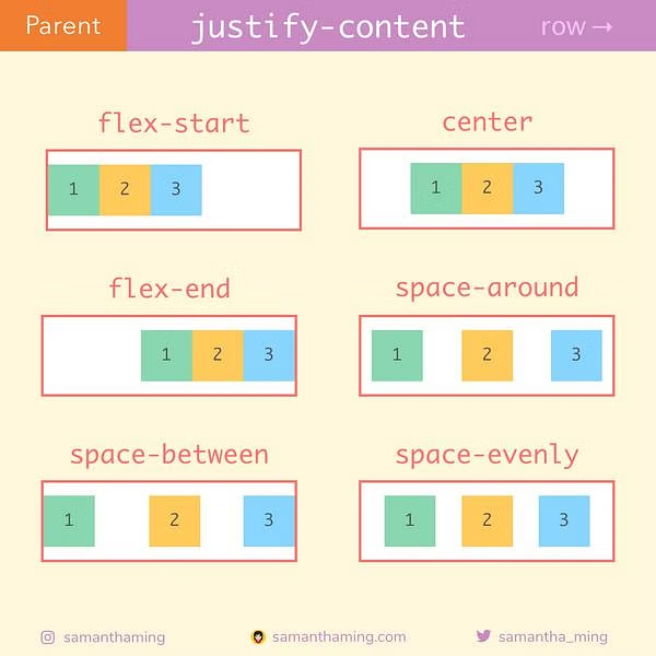
- The Image with Justify Content Properties Values
I.Justify-content - flex-start
The
flex-startvalue aligns the flex items at the beginning of the container.It is this is the default of justify-content.
Syntax:
    .container{
    display: flex;
    justify-content: flex-start;
Example:
-
II.Justify-content: Flex-end
The
flex-endvalue aligns the flex items at the end of the container.Syntax:
                              .container{
                              display: flex;
                              justify-content: flex-end;
Example:
III.Justify-content: center
The
centervalue aligns the flex items at the center of the container.Syntax:
                              .container{
                              display: flex;
                              justify-content: center;
Example:
-
IV.Justify-content: space-between
The
space-betweenvalue displays the flex items with space between the lines.Flex items display with equal spacing between them.
Syntax:
                              .container{
                              display: flex;
                              justify-content: space-between;
Example:
-
V.Justify-content - space-around
The
space-aroundvalue displays the flex items with space before, between, and after the lines.Flex items display with equal spacing around them.
Syntax:
                              .container{
                              display: flex;
                              justify-content: space-around;
Example:
-
VI.Justify-content: space-evenly
The items are evenly distributed within the alignment container along the main axis.
The spacing between each pair of adjacent items, the main-start edge and the first item, and the main-end edge and the last item, are all the same.
Syntax:
                              .container{
                              display: flex;
                              justify-content: space-evenly;
Example:
-
- The Image with Justify Content Properties values
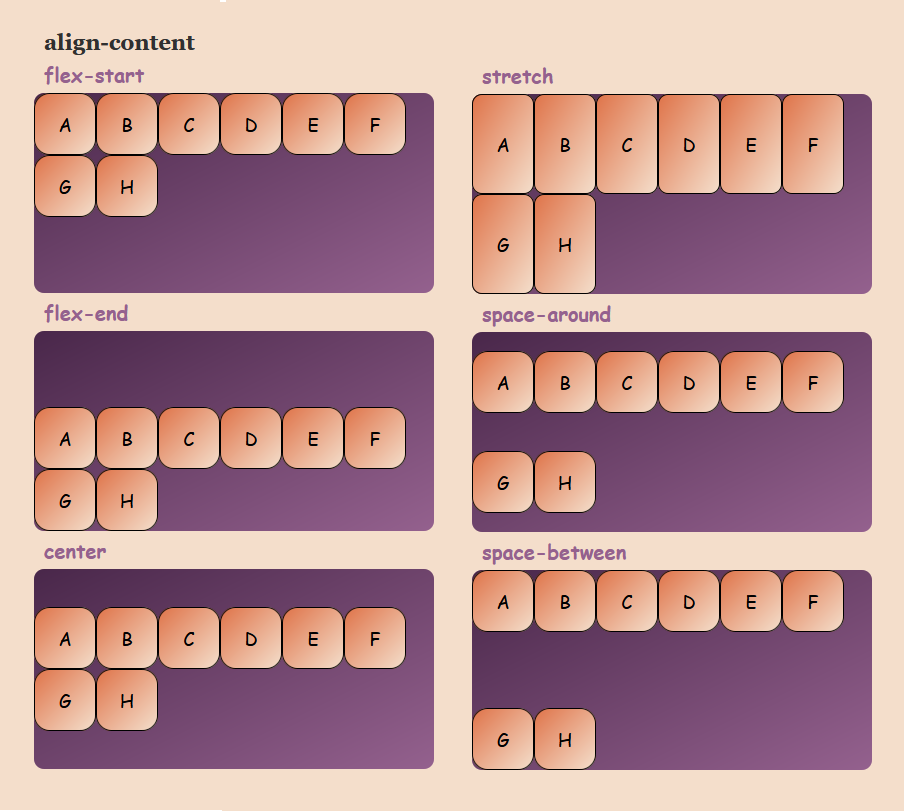
5.Align-Items
Align-items are used to align the flex items vertically when the items do not use all available space on the cross-axis.
The
align-itemsproperty is used to align the flex items.Syntax:
.container{
display: flex;
align-items: flex-start | flex-end | center | stretch | baseline;

The Image with Align Items property values
I.Align-Items: Flex-Start
The
flex-startvalue aligns the flex items at the top of the container.Syntax:
                            .container{
                            display: flex;
                            align-items: flex-start;
Example:
-
II.Align-Items - Flex-End
The
flex-endvalue aligns the flex items at the bottom of the container.Syntax:
                            .container{
                            display: flex;
                            align-items: flex-end;
Example:
III.Align-Items - Center
The
centervalue aligns the flex items in the middle of the container.Syntax:
                            .container{
                            display: flex;
                            align-items: center;
Example:
-
IV.Align-Items - Stretch
The
stretchvalue stretches the flex items to fill the container.It is the default value of align-items.
Flex items are stretched such that the cross-size of the item's margin box is the same as the line while respecting width and height constraints.
Syntax:
                            .container{
                            display: flex;
                            align-items: stretch;
Example:
-
V.Align-Items - Baseline
The
baselinevalue aligns the flex items such as their baselines aligns.All flex items are aligned such that their flex container baselines align.
The item with the largest distance between its cross-start margin edge and its baseline is flushed with the cross-start edge of the line.
Syntax:
                            container {
                              display: flex;
                              align-items: baseline;
                            }
Example:
-

- The Image with Align Items property values
6.Align-Content
The
align-contentproperty is used to align the flex lines.The
align-contentproperty sets the distribution of space between and around content items along a flexbox's cross-axis or a grid's block axis.Syntax:
.container{
display: flex;
align-content: flex-start | flex-end | center | stretch | space-around  | space-between;
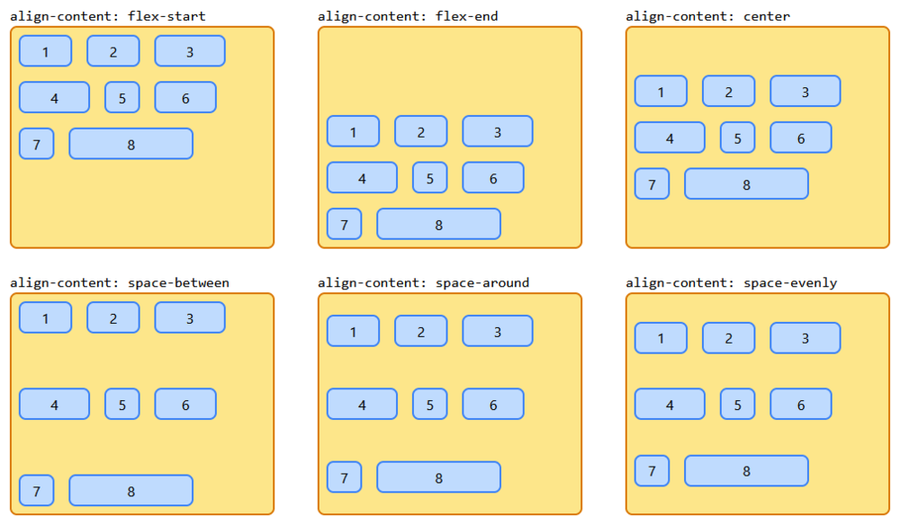
The Image with Align Content property values
I. Align- Content: flex-start
The
flex-startvalue displays the flex lines at the start of the container.The items are packed flush with each other against the edge of the alignment container depending on the flex container's cross-start side.
This only applies to flex layout items. For items that are not children of a flex container, this value is treated like
start.Syntax:
                            .container{
                            display: flex;
                            align-content: flex-start;
Example:
-
II.Align-Content - flex-end
The
flex-endvalue displays the flex lines at the end of the container.The items are packed flush to each other against the edge of the alignment container depending on the flex container's cross-end side.
This only applies to flex layout items.
For items that are not children of a flex container, this value is treated like
end.Syntax:
                            .container{
                            display: flex;
                            align-content: flex-end;
Example:
-
III.Align-Content - Center
The
centervalue displays display the flex lines in the middle of the container.The items are packed flush with each other in the center of the alignment container along the cross-axis.
Syntax:
                            .container{
                            display: flex;
                            align-content: center;
Example:
-
IV.Align-content - Stretch
The
stretchvalue stretches the flex lines to take up the remaining space.It is the default value of Align content.
Syntax:
                            .container{
                            display: flex;
                            align-content: stretch;
Example:
-
V.Align-Content - Space Between
The
space-betweenvalue displays the flex lines with equal space between them.Syntax:
                            .container{
                            display: flex;
                            align-content: space-between;
Example:
-
VI.Align-Content - Space- Around
The
space-aroundvalue displays the flex lines with space before, between, and after them.Syntax:
                            .container{
                            display: flex;
                            align-content: space-around;
Example:
-
- The Image with Align Content property values
7.Gap
The Gap property explicitly controls space between flex items.
It applies that spacing only between items not on the outer edge.
The property sets the gap between rows and columns. It is a shorthand for row-gap and column-gap.
Image with gap property example is:
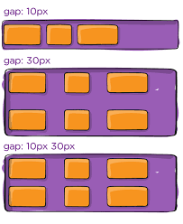
Syntax:
                .container{
                display: flex;
                gap: <'row-gap'> <'column-gap'>
                }
Example:
-
The Image with row gap of 20 pixels and a column gap of 40 pixels.
(2)Flex Items
The Flex Items specify the properties of the children.
There may be one or more flex items inside a flex container.
Flexbox specifies how flex items are set inside a flex container. It sets the flex items inside a flex container along a flex line.
By default, there is only one flex line per flex container. Everything outside a flex container and inside a flex item is considered as usual.
The Flex Item Properties are:
1. Order
2. Flex Grow
3. Flex Shrink
4. Flex Basis
5. flex
6. Align Self
1.Order
It specifies the order of a flexible item relative to the rest of the flex items inside the same container.
The
orderproperty specifies the order of the flex items.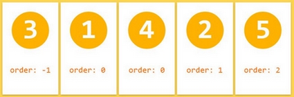
The Image shows five flex items with their order values in a flex container.
EXAMPLE 1:
Let's take an example to show six flex items within a flex container.
By default, they are set along the horizontal flex line, from left to right.
-

The Image shows four flex items with their order values in a flex-container.
EXAMPLE 2:
-
2.Flex-Grow
The flex-grow property specifies how much a flex item will grow relative to the rest of the flex items.
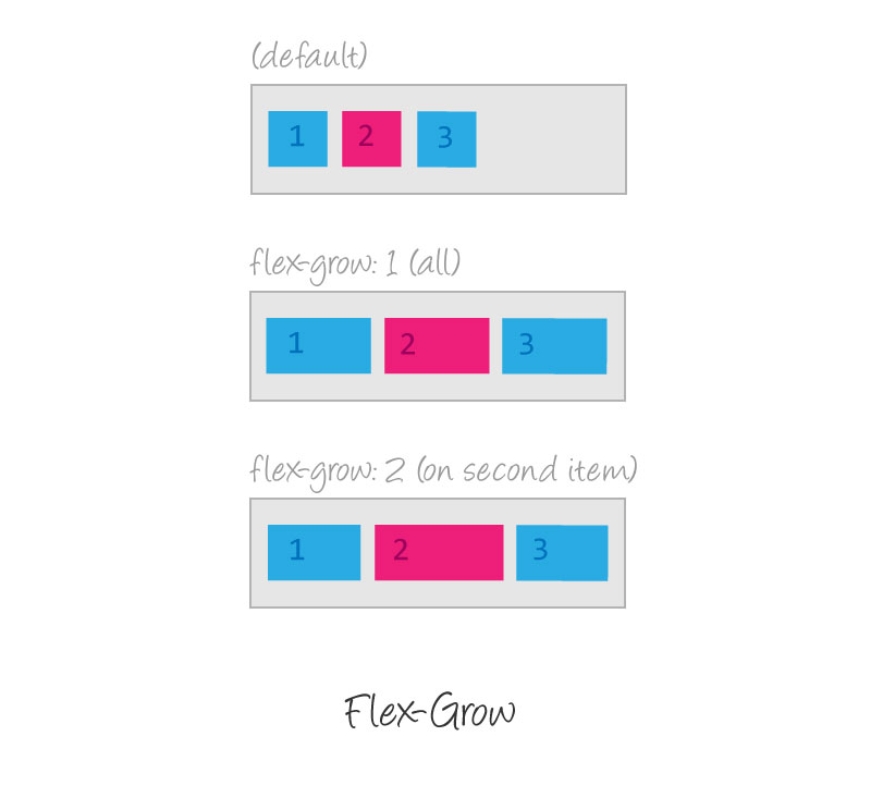
The Image shows three flex items with their flex-grow values in a flex container.
The value must be a number, the default value is 0.
Example:
-
It increases the width of the flex items.
Make the second flex item grow eight times and the fifth flex item grows six times faster than the other flex items.
3.Flex Shrink
The flex-shrink property specifies how much a flex item will shrink relative to the rest of the flex items.

The Image shows three flex items with their flex-grow and flex-shrink values in a flex container.
The value must be a number, the default value is 1.
Example:
-
4.Flex Basis
The flex-basis property specifies the initial length of a flex item.

The Image shows five flex items with their flex-basis values in a flex container.
EXAMPLE:
Set the initial length of the fifth and eighth flex items to 150 pixels and 250 pixels respectively :
-
5.Flex
The flex property is a shorthand property for the flex-grow, flex-shrink and flex-basis properties.
it specifies the length of a flex item, relative to the rest of the flex items inside the same container.

Make the fourth flex item with a flex-grow value of 0(default value), a flex-shrink value of 1 (default value) and a flex-basis an initial length of 300 pixels.
EXAMPLE:
-
6.Align Self
The align-self property specifies the alignment for the selected item inside the flexible container.
It is used on flex items.
The align-self property overrides the default alignment set by the container's Align Items property.

The "align-self: flex-start;" aligns the selected flex item at the top of the container.
The "align-self: center;" aligns the selected flex item in the middle of the container.
The "align-self: flex-end;" aligns the selected flex item at the bottom of the container.
EXAMPLE:
Make the third flex item at the top of the container, the sixth flex item in the middle of the container and the ninth flex item at the bottom of the container
-

The Image shows how the flex items are aligned within a flex container.


